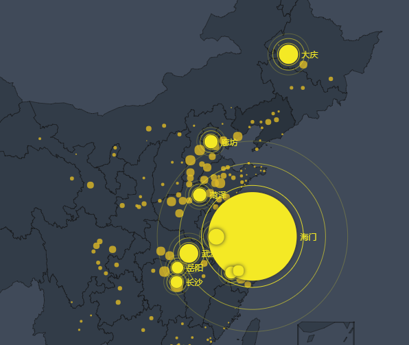
上面图标这个太大了,是因为数据源里面有的很大,有的很小。我通过哪里去调节这个大小的比例和显示亮的程度,辐射的区域呢?
官网类似这种链接是:http://echarts.baidu.com/demo.html#map-polygon
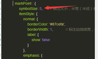
我觉得主要问题是我应该修改这里:
series : [
{
name: 'pm2.5',
type: 'scatter',
coordinateSystem: 'geo',
data: convertData(data),
symbolSize: function (val) {
return val[2] / 10;
},
label: {
normal: {
formatter: '{b}',
position: 'right',
show: false
},
emphasis: {
show: true
}
},
itemStyle: {
normal: {
color: '#ddb926'
}
}
},
{
name: 'Top 5',
type: 'effectScatter',
coordinateSystem: 'geo',
data: convertData(data.sort(function (a, b) {
return b.value - a.value;
}).slice(0, 10)),
symbolSize: function (val) {
return val[2] / 10;
},
showEffectOn: 'render',
rippleEffect: {
brushType: 'stroke'
},
hoverAnimation: true,
label: {
normal: {
formatter: '{b}',
position: 'right',
show: true
}
},
itemStyle: {
normal: {
color: '#f4e925',
shadowBlur: 10,
shadowColor: '#333'
}
},
zlevel: 1
}
]