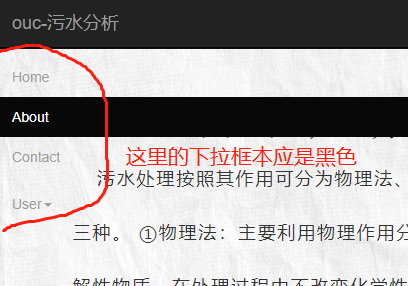
下拉菜单被遮罩(flex布局,bootstrap导航栏组件)如何解决
尝试过设置z-index 没解决
test.html
<!DOCTYPE html>
<html>

    <head>
        <meta charset="utf-8">
        <meta http-equiv="X-UA-Compatible" content="IE=edge">
        <!--保证缩放-->
        <meta name="viewport" content="width=device-width, initial-scale=1">
        <!-- 上述3个meta标签*必须*放在最前面,任何其他内容都*必须*跟随其后! -->

        <!-- 引入bootstrap-->
        <link rel="stylesheet" type="text/css" href="bootstrap/3.3.7/css/bootstrap.min.css" />
        <script type="text/javascript" src="bootstrap/3.3.7/js/jquery-3.3.1.min.js"></script>
        <script src="bootstrap/3.3.7/js/bootstrap.min.js"></script>
        <!-- 引入自定义样式 -->
        <link rel="stylesheet" href="css/test.css">


        <!-- 添加网站图标 -->
        <link rel="icon" href="img/water.ico" type="image/x-icon" />
        <link rel="shortcut icon" href="img/water.ico" type="image/x-icon" />
        <title>ouc-污水分析-about</title>
    </head>

    <body class="bg-img">

        <!-- Static navbar -->
        <nav class="zmost navbar  navbar-inverse navbar-default navbar-static-top">
            <div class="container">
                <div class="navbar-header">
                    <button type="button" class="navbar-toggle collapsed" data-toggle="collapse" data-target="#navbar" aria-expanded="false" aria-controls="navbar">
                    <span class="sr-only">Toggle navigation</span>
                    <span class="icon-bar"></span>
                    <span class="icon-bar"></span>
                    <span class="icon-bar"></span>
                </button>
                    <a class="navbar-brand" href="#">ouc-污水分析</a>
                </div>
                <div id="navbar" class="navbar-collapse collapse">
                    <ul class="nav navbar-nav">
                        <li>
                            <a href="index.html">Home</a>
                        </li>
                        <li class="active">
                            <a href="about.html">About</a>
                        </li>
                        <li>
                            <a href="contact.html">Contact</a>
                        </li>
                    </ul>
                    <ul class="nav navbar-nav navbar-right">
                        <li class="dropdown">
                            <a href="#" class="dropdown-toggle" data-toggle="dropdown" role="button" aria-haspopup="true" aria-expanded="false">User<span class="caret"></span></a>
                            <ul class="dropdown-menu">
                                <li>
                                    <a href="#">Action</a>
                                </li>
                                <li>
                                    <a href="#">Something else here</a>
                                </li>
                                <li role="separator" class="divider"></li>
                                <li class="dropdown-header">Nav header</li>
                                <li>
                                    <a href="#">Separated link</a>
                                </li>
                                <li>
                                    <a href="#">One more separated link</a>
                                </li>
                            </ul>
                        </li>
                    </ul>
                </div>
            </div>
        </nav>

        <!-- About info -->
        <div class="container about zless">
            <h1 class="about-title flex-center-block">网站声明</h1>
            <p class="about-content flex-center-block">
                污水处理按照其作用可分为物理法、生物法和化学法三种。 ①物理法:主要利用物理作用分离污水中的非溶解性物质,在处理过程中不改变化学性质。常用的有重力分离、离心分离、反渗透、气浮等。物理法处理构筑物较简单、经济,用于村镇水体容量大、自净能力强、污水处理程度要求不高的情况。 ②生物法:利用微生物的新陈代谢功能,将污水中呈溶解或胶体状态的有机物分解氧化为稳定的无机物质,使污水得到净化。常用的有活性污泥法和生物膜法。生物法处理程度比物理法要高。 ③化学法:是利用化学反应作用来处理或回收污水的溶解物质或胶体物质的方法,多用于工业废水。常用的有混凝法、中和法、氧化还原法、离子交换法等。化学处理法处理效果好、费用高,多用作生化处理后的出水,作进一步的处理,提高出水水质。
            </p>
        </div>

        <!-- footer -->
        <div class="footer">@Copyright-中国海洋大学</div>
    </body>

</html>
test.css
bg-img {
    background-image: url(../img/bg.jpg);
    background-repeat: no-repeat;
    background-attachment: fixed;
    background-position: center;
    background-size: 100%;
    -moz-background-size: 100% 100%;
    -webkit-background-size: 100% 100%;
}
body {
    display: flex;
    flex-direction: column;
    justify-content: space-between;
    height: calc(100vh);
    min-width: 380px;
    min-height: 680px;
}

.footer {
    height: 50px;
    width: 100%;
    background-color: #222;
    text-align: center;
    color: rgb(157, 157, 157);
    font-family: Arial;
    font-size: large;
    letter-spacing: 1px;
    line-height: 50px;
}

flex-header {
    /*background-color: lightblue;*/
}

.flex-container{
    /*background-color: lightgreen;*/
}

.flex-footer {
    /*background-color: lightblue;*/
}


.flex-center {
    display: flex;
    flex-direction: column;
    align-items: center;
    justify-content: center;
}

.flex-center-block {
    padding-right: 15px;
    padding-top: 15px;
    display: flex;
    align-items: center;
    justify-content: center;
}

.about{
    padding-bottom: 15%;
}

.about-title {

    letter-spacing: 0.5em;
    font-family: "宋体";
    font-weight: bold;
}

.about-content {
    font-size: large;
    padding: 0% 10%;
    line-height: 3em;
    letter-spacing: 0.1em;
    text-indent: 5%
}


