
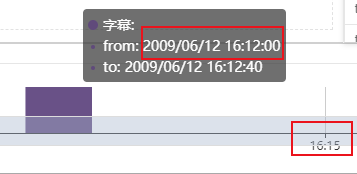
如图,提示想让提示框里显示的时间的格式和下面一样只显示时分秒该怎么弄呢?
下面是代码:
    let myChart = echarts.init(document.getElementById('timeShaft'));
    var data = [['2009/6/12 16:09:00', '2009/6/12 16:09:40', 1, 'A','字幕'], ['2009/6/12 16:10:00', '2009/6/12 16:10:10', 1, 'B','字幕'], ['2009/6/12 16:12:00', '2009/6/12 16:12:40', 1, 'C','字幕'], ['2009/6/12 16:18:00', '2009/6/12 16:18:10', 1, 'D','字幕']];
    var colorList = ['#4f81bd', '#9bbb59', '#604a7b']; // , '#e46c0b' '#3a3d44',

    data = echarts.util.map(data, function (item, index) {
        return {
            value: item,
            itemStyle: {
                normal: {
                    color: colorList[index % 3]
                }
            }
        };
    });

    function renderItem(params, api) {
        var yValue = api.value(2);
        var start = api.coord([api.value(0), yValue]);
        var size = api.size([api.value(1) - api.value(0), yValue]);
        var style = api.style();

        return {
            type: 'rect',
            shape: {
                x: start[0],
                y: start[1],
                width: size[0],
                height: size[1]
            },
            style: style
        };
    }

    let option = {
        title: {
            // text: 'Profit',
            left: 'center'
        },
        tooltip: {
        },
        xAxis: {
            scale: true,
            type:'time'
            // splitLine:{show:false}, // 网格线
        },
        yAxis: {
            splitLine:{show:false}, // 网格线
            axisLabel:[1,2]
        },
        dataZoom: [
            {
                type: 'slider',
                start: 0,
                end: 100
            },
            {
                type: 'inside',
                start: 0,
                end: 100
            }
        ],
        series: [{
            type: 'custom',
            renderItem: renderItem,
            label: {
                normal: {
                    show: true,
                    position: 'top'
                }
            },
            dimensions: ['from', 'to'],
            encode: {
                x: [0, 1],
                y: 2,
                tooltip: [0, 1],
                itemName: 4
            },
            data: data
        }],
        grid: {
            left: '20px',
            right: '20px',
            top: '4px',
            bottom: '20px'
        }
    };

    // 使用刚指定的配置项和数据显示图表。
    myChart.setOption(option);


