
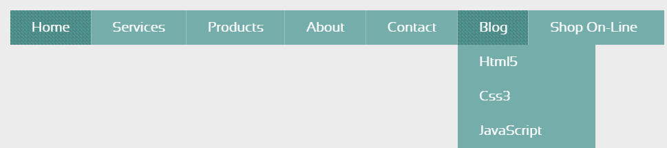
IE8以下二级菜单没有3D效果,一直静态显示的,鼠标不移动到Blog菜单上也显示那底下二级菜单。在IE11,谷歌浏览器等中正常。代码如下:
/* basic menu styles */
.nav-menu {
display: block;
background: #74adaa;
width:950px;
margin: 50px auto 150px;
}
.nav-menu > li {
display: inline;
float:left;
border-right:1px solid #94c0be;
}
.nav-menu > li:last-child {
border-right: none;
}
.nav-menu li a {
color: #fff;
display: block;
text-decoration: none;
font-family: 'sansationregular';
-webkit-font-smoothing: antialiased;
-moz-font-smoothing: antialiased;
font-smoothing: antialiased;
text-transform: capitalize;
overflow: visible;
line-height: 20px;
font-size: 20px;
padding: 15px 30px 15px 31px;
}
/* animation domination */
.three-d {
perspective: 200px;
transition: all .07s linear;
position: relative;
}
.three-d:not(.active):hover {
cursor: pointer;
}
.three-d:not(.active):hover .three-d-box,
.three-d:not(.active):focus .three-d-box {
transform: translateZ(-25px) rotateX(90deg);
}
.three-d-box {
transition: all .3s ease-out;
transform: translatez(-25px);
transform-style: preserve-3d;
pointer-events: none;
position: absolute;
top: 0;
left: 0;
display: block;
width: 100%;
height: 100%;
}
.front {
transform: rotatex(0deg) translatez(25px);
}
.back {
transform: rotatex(-90deg) translatez(25px);
color: #FFE7C4;
}
.front, .back {
display: block;
width: 100%;
height: 100%;
position: absolute;
top: 0;
left: 0;
background: #74adaa;
padding: 15px 30px 15px 31px;
color: white;
pointer-events: none;
box-sizing: border-box;
}
.nav-menu li .active .front,
.nav-menu li .active .back,
.nav-menu li a:hover .front,
.nav-menu li a:hover .back {
background-color: #51938f;
background-size: 5px 5px;
background-position: 0 0, 30px 30px;
background-image: -*-linear-gradient(45deg, #478480 25%, transparent 25%, transparent 75%, #478480 75%, #478480), linear-gradient(45deg, #478480 25%, transparent 25%, transparent 75%, #478480 75%, #478480);
}
.nav-menu ul {
position: absolute;
text-align: left;
line-height: 40px;
font-size: 14px;
width: 200px;
transition: all 0.3s ease-in;
transform-origin: 0px 0px;
transform: rotateX(-90deg);
backface-visibility: hidden;
}
.nav-menu > li:hover ul {
display: block;
transform: rotateX(0deg);
}


