Sxd0208 2017-02-23 10:37 采纳率: 100%
浏览 23964
已采纳

echarts的图例的图形的颜色怎么改变?

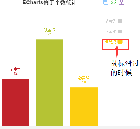
echarts的图例的图形的颜色怎么改变?我的一直是灰色的 然后hover滑过时 就变成了和
下面柱形图一直的颜色;我不需要hover,只需要它没有hover的时候也和柱形图的颜色保持一致
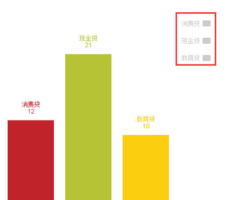
图片说明
图片说明

<!DOCTYPE html>
<html lang="en">
<head>
    <meta charset="UTF-8">
    <title>Title</title>
    <script src="echarts-all.js"></script>
    <style>
        .aaa{
            width: 500px;
            height: 500px;
        }
    </style>
</head>
<body>
<div class="aaa" id="annular"></div>
<script>
    var aaa = echarts.init(document.getElementById('annular'));
    option = {
        title: {
            x: 'center',
            text: 'ECharts例子个数统计'
        },
        tooltip: {
            trigger: 'item'
        },
        legend:{
            //selectedMode: false,
            x:'right',
            y:70,
            align:'right',
            itemWidth:16,
            itemGap:20,
            orient:'vertical',
            data:[{name:'消费贷',textStyle:{color:'#C1232B'}},
                   {name:'现金贷',textStyle:{color:'#B5C334'}},
                   {name:'教育贷',textStyle:{color:'#FCCE10'}}
            ],
            selected:{
                '消费贷':true,
                '现金贷':true,
                '教育贷':true
            }
        },
        color:['#C1232B','#B5C334','#FCCE10'],
        toolbox: {
            show: true,
            feature: {
                dataView: {show: true, readOnly: false},
                restore: {show: true},
                saveAsImage: {show: true}
            }
        },
        calculable: true,
        grid: {
            borderWidth: 0,
            y: 80,
            y2: 60
        },
        xAxis: [
            {
                type: 'category',
                show: false,
                data: ['消费贷', '现金贷', '教育贷']
            }
        ],
        yAxis: [
            {
                type: 'value',
                show: false
            }
        ],
        series: [
            {
                name: 'ECharts例子个数统计',
                type: 'bar',
                itemStyle: {
                    normal: {
                        color: function(params) {
                            // build a color map as your need.
                            var colorList = [
                                '#C1232B','#B5C334','#FCCE10','#E87C25','#27727B',
                                '#FE8463','#9BCA63','#FAD860','#F3A43B','#60C0DD',
                                '#D7504B','#C6E579','#F4E001','#F0805A','#26C0C0'
                            ];
                            return colorList[params.dataIndex]
                        },
                        label: {
                            show: true,
                            position: 'top',
                            formatter: '{b}\n{c}'
                        }
                    }
                },
                data: [12,21,10],
                markPoint: {
                    tooltip: {
                        trigger: 'item',
                        backgroundColor: 'rgba(0,0,0,0)'
                    },
                    data: [
                        {xAxis:0, y: 350, name:'Line', symbolSize:20, symbol:'none'},
                        {xAxis:1, y: 350, name:'Bar', symbolSize:20,symbol:'none'},
                        {xAxis:2, y: 350, name:'Scatter', symbolSize:20,symbol:'none'}
                    ]
                }
            }
        ]
    };
    aaa.setOption(option);
</script>
</body>
</html>
  • 写回答

6条回答 默认 最新

  • 当作看不见 2017-02-24 09:19
    关注

    先和你说一下问题在哪里吧 ,系统默认就是legend的颜色和条形的颜色一样的,不过前提条件是你的series 数据的name 属性和legend的 data数组一一对应.这里你的series 只有一个数组 ,需要分成三列才能正确的显示legend ,所以你这个配置有一些问题 ,如果真的想按自己的方式生成图形的话,有一个
    D3.js提供一个工具集,可以自己自由绘制图形.

    option = {
            title: { x: 'center', text: 'ECharts例子个数统计' },
            tooltip: { trigger: 'item' },
            legend: {
                selectedMode: false,
                orient: 'vertical',
                data: ['消费贷','现金贷','教育贷'],
            },
            color: ['#C1232B', '#B5C334', '#FCCE10'],
            toolbox: {
                show: true,
                feature: {
                    dataView: {
                        show: true,
                        readOnly: false
                    },
                    restore: {
                        show: true
                    },
                    saveAsImage: {
                        show: true
                    }
                }
            },
            calculable: true,
            grid: { borderWidth: 0, y: 80, y2: 60 },
            xAxis: [
            { type: 'category',
            show: false,
            data: ['消费贷', '现金贷', '教育贷'] }],
            yAxis: [{ type: 'value', show: false }],
            series: [{
                name: '消费贷',
                type: 'bar',
                barWidth:40,
                itemStyle: {
                    normal: {
                        color: function(params) { // build a color map as your need. 
                            var colorList = ['#C1232B', '#B5C334', '#FCCE10', '#E87C25', '#27727B', '#FE8463', '#9BCA63', '#FAD860', '#F3A43B', '#60C0DD', '#D7504B', '#C6E579', '#F4E001', '#F0805A', '#26C0C0'];
                            return colorList[params.dataIndex]
                        },
                        label: { show: true, position: 'top', formatter: '{b}\n{c}' }
                    }
                },
                data: [12,null,null],
                markPoint: { tooltip: { trigger: 'item', backgroundColor: 'rgba(0,0,0,0)' }, data: [{ xAxis: 0, y: 350, name: 'Line', symbolSize: 20, symbol: 'none' }, { xAxis: 1, y: 350, name: 'Bar', symbolSize: 20, symbol: 'none' }, { xAxis: 2, y: 350, name: 'Scatter', symbolSize: 20, symbol: 'none' }] }
            },{
                name: '现金贷',
                type: 'bar',
                barWidth:40,
                itemStyle: {
                    normal: {
                        color: function(params) { // build a color map as your need. 
                            var colorList = ['#C1232B', '#B5C334', '#FCCE10', '#E87C25', '#27727B', '#FE8463', '#9BCA63', '#FAD860', '#F3A43B', '#60C0DD', '#D7504B', '#C6E579', '#F4E001', '#F0805A', '#26C0C0'];
                            return colorList[params.dataIndex]
                        },
                        label: { show: true, position: 'top', formatter: '{b}\n{c}' }
                    }
                },
                data: [null, 21, ],
                markPoint: { tooltip: { trigger: 'item', backgroundColor: 'rgba(0,0,0,0)' }, data: [{ xAxis: 0, y: 350, name: 'Line', symbolSize: 20, symbol: 'none' }, { xAxis: 1, y: 350, name: 'Bar', symbolSize: 20, symbol: 'none' }, { xAxis: 2, y: 350, name: 'Scatter', symbolSize: 20, symbol: 'none' }] }
            },
            {
                name: '教育贷',
                type: 'bar',
                barWidth:40,
                itemStyle: {
                    normal: {
                        color: function(params) { // build a color map as your need. 
                            var colorList = ['#C1232B', '#B5C334', '#FCCE10', '#E87C25', '#27727B', '#FE8463', '#9BCA63', '#FAD860', '#F3A43B', '#60C0DD', '#D7504B', '#C6E579', '#F4E001', '#F0805A', '#26C0C0'];
                            return colorList[params.dataIndex]
                        },
                        label: { show: true, position: 'top', formatter: '{b}\n{c}' }
                    }
                },
                data: [null,null, 10],
                markPoint: { tooltip: { trigger: 'item', backgroundColor: 'rgba(0,0,0,0)' }, data: [{ xAxis: 0, y: 350, name: 'Line', symbolSize: 20, symbol: 'none' }, { xAxis: 1, y: 350, name: 'Bar', symbolSize: 20, symbol: 'none' }, { xAxis: 2, y: 350, name: 'Scatter', symbolSize: 20, symbol: 'none' }] }
            }
            ]
        };
    
    本回答被题主选为最佳回答 , 对您是否有帮助呢?
    评论
查看更多回答(5条)

报告相同问题?

悬赏问题

  • ¥15 Stata 面板数据模型选择
  • ¥20 idea运行测试代码报错问题
  • ¥15 网络监控:网络故障告警通知
  • ¥15 django项目运行报编码错误
  • ¥15 请问这个是什么意思?
  • ¥15 STM32驱动继电器
  • ¥15 Windows server update services
  • ¥15 关于#c语言#的问题:我现在在做一个墨水屏设计,2.9英寸的小屏怎么换4.2英寸大屏
  • ¥15 模糊pid与pid仿真结果几乎一样
  • ¥15 java的GUI的运用