
做的名片页面,现在在电脑端打开是正常的,
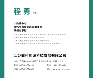
但是手机端打开就字体起飞
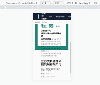
怎么能给字体加个自适应,让字体大小随可以自动缩放?页面代码如下
<template>
<div id="business">
<div class="mycard">
<el-image :src="url" :fit="fill" @load="setEL" />
<div class="word" :style="position">
<div class="info">
<h1><span>程勇</span><a>主任</a></h1>
</div>
<div class="body">
<div class="title">
<h6>
<label>大数据中心</label><br>
<label>绿色交通企业服务事业部</label><br>
<label>苏州办事处</label>
</h6>
</div>
<div class="loc">
<label>综合交通运输大数据处理及应用技术交通运输行业研发中心</label><br>
<label>交通运输节能减排第三方审核机构</label><br>
<label>江苏交通运输行业能耗排放监测统计中心</label><br>
<label>江苏省绿色循环低碳技术成果转化公共技术服务平台</label><br>
</div>
</div>
<div class="con">
<h3>江苏交科能源科技发展有限公司</h3>
<label>地址: 江苏省南京市水西门大街223号2F</label>
<label>邮编: 210017</label><br>
<label>手机: 13921983094</label>
<label>电话: 025-86778219</label><br>
<label>传真: 025-86778016</label>
<label>网址: www.enytek.com</label><br>
</div>
</div>
</div>
</div>
</template>
背景图片计算代码如下
<script>
export default {
  name: 'BusinessCard',
  data() {
    return {
      url: 'https://s2.loli.net/2021/12/27/jREPNUuaK2L4cQx.jpg',
      el: null,
      fill: 'fill',
      imgSourceWidh: 2480, // 原始图片宽度
      // 原始图片空白位置大小
      oleft: 200,
      otop: 1925,
      owidth: 2120,
      oheight: 2075,
      position: {
        // 计算后的值
        left: 0,
        top: 0,
        width: 0,
        height: 0
      }
    }
  },
  mounted() {
    var t
    window.addEventListener('resize', () => {
      clearTimeout(t)
      t = setTimeout(() => {
        this.resizeWordPosition()
      }, 30)
    })
  },
  methods: {
    resizeWordPosition() {
      // 2480x4256
      var rate = this.el.offsetWidth / this.imgSourceWidh
      for (var attr in this.position) {
        this.position[attr] = Math.floor(this['o' + attr] * rate) + 'px'
      }
    },
    setEL(e) {
      this.el = e.target
      this.resizeWordPosition()
    }
  }
}
</script>
css代码如下
<style lang="scss" scoped>
.mycard {
  position: relative;
}
.mycard .word {
  position: absolute;
  left: 25px;
  top: 250px;
  width: 275px;
  height: 265px;
  box-sizing: border-box;
  padding: 10px;
  // background: rgba(255, 254, 254, 0.5);
  letter-spacing:2px
}
#business {
  max-width: 100vh;
  max-height: 100vh;
}
h1,h3,h6 {
  margin: 0;
}
.info,.body,.con {
  width: 80%;
  margin: 10% 10% 10% 10%;
}
.info {
  height: 52px;
}
.info span {
  color: #1f8577;
  letter-spacing: 20px;
  font-size: 60px;
}
.info a {
  color: #000;
  font-weight: 530;
  font-size: 20px;
}
.title {
  height: 80px;
}
.title label {
  line-height: 30px;
  font-size: 20px;
}
.loc {
  margin-top: 16px;
}
.loc label {
  line-height: 26px;
  font-size: 15px;
  font-weight: 200;
}
.con h3 {
  font-size: 30px;
  margin-bottom: 10px;
}
.con label {
  margin: 15px 10px 0 0;
  display: inline-block;
  font-weight: 350;
}
.con label:nth-child(n + 6) {
  width: 50%;
  margin-right: 0;
  float: left;
}
</style>
搜素的几个用px2rem的试过了,只会改变电脑端显示的字体大小和样式,对在手机上打开完全无效,有什么好的思路或者例子吗?


