import pandas as pd
import numpy as np
from sklearn.cluster import KMeans
import matplotlib.pyplot as plt
datafile = "air_data.csv"
data = pd.read_csv(datafile, encoding="utf-8")
print(data)
print(data.shape)
print(data.info())
print(data[0:5])
filter_data = data[[ "FFP_DATE", "LOAD_TIME", "FLIGHT_COUNT", "SUM_YR_1", "SUM_YR_2", "SEG_KM_SUM", "AVG_INTERVAL" , "MAX_INTERVAL", "avg_discount"]]
filter_data[0:5]
data["LOAD_TIME"] = pd.to_datetime(data["LOAD_TIME"])
data["FFP_DATE"] = pd.to_datetime(data["FFP_DATE"])
data["入会时间"] = data["LOAD_TIME"] - data["FFP_DATE"]
data["平均每公里票价"] = (data["SUM_YR_1"] + data["SUM_YR_2"]) / data["SEG_KM_SUM"]
data["时间间隔差值"] = data["MAX_INTERVAL"] - data["AVG_INTERVAL"]
deal_data = data.rename(
columns = {"FLIGHT_COUNT" : "飞行次数", "SEG_KM_SUM" : "总里程", "avg_discount" : "平均折扣率"},
inplace = False
)
filter_data = deal_data[["入会时间", "飞行次数", "平均每公里票价", "总里程", "时间间隔差值", "平均折扣率"]]
print(filter_data[0:5])
filter_data['入会时间'] = filter_data['入会时间'].astype(np.int64)/(60*60*24*10**9)
print(filter_data[0:5])
print(filter_data.info())
filter_zscore_data = (filter_data - filter_data.mean(axis=0))/(filter_data.std(axis=0))
filter_zscore_data[0:5]
def distEclud(vecA, vecB):
"""
计算两个向量的欧式距离的平方,并返回
"""
return np.sum(np.power(vecA - vecB, 2))
def test_Kmeans_nclusters(data_train):
"""
计算不同的k值时,SSE的大小变化
"""
data_train = data_train.values
nums=range(2,10)
SSE = []
for num in nums:
sse = 0
kmodel = KMeans(n_clusters=num, n_jobs=4)
kmodel.fit(data_train)
# 簇中心
cluster_ceter_list = kmodel.cluster_centers_
# 个样本属于的簇序号列表
cluster_list = kmodel.labels_.tolist()
for index in range(len(data)):
cluster_num = cluster_list[index]
sse += distEclud(data_train[index, :], cluster_ceter_list[cluster_num])
print("簇数是",num , "时; SSE是", sse)
SSE.append(sse)
return nums, SSE
nums, SSE = test_Kmeans_nclusters(filter_zscore_data)
#画图,通过观察SSE与k的取值尝试找出合适的k值
# 中文和负号的正常显示
plt.rcParams['font.sans-serif'] = 'SimHei'
plt.rcParams['font.size'] = 12.0
plt.rcParams['axes.unicode_minus'] = False
# 使用ggplot的绘图风格
plt.style.use('ggplot')
## 绘图观测SSE与簇个数的关系
fig=plt.figure(figsize=(10, 8))
ax=fig.add_subplot(1,1,1)
ax.plot(nums,SSE,marker="+")
ax.set_xlabel("n_clusters", fontsize=18)
ax.set_ylabel("SSE", fontsize=18)
fig.suptitle("KMeans", fontsize=20)
plt.show()
kmodel = KMeans(n_clusters=6, n_jobs=6)
kmodel.fit(filter_zscore_data)
# 简单打印结果
r1 = pd.Series(kmodel.labels_).value_counts() #统计各个类别的数目
r2 = pd.DataFrame(kmodel.cluster_centers_) #找出聚类中心
# 所有簇中心坐标值中最大值和最小值
max = r2.values.max()
min = r2.values.min()
r = pd.concat([r2, r1], axis = 1) #横向连接(0是纵向),得到聚类中心对应的类别下的数目
r.columns = list(filter_zscore_data.columns) + [u'类别数目'] #重命名表头
# 绘图
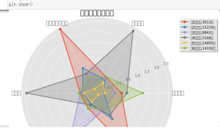
fig=plt.figure(figsize=(10, 8))
ax = fig.add_subplot(111, polar=True)
center_num = r.values
feature = np.array(["入会时间", "飞行次数", "平均每公里票价", "总里程", "时间间隔差值", "入会时间"])
N =len(feature)
for i, v in enumerate(center_num):
# 设置雷达图的角度,用于平分切开一个圆面
angles=np.linspace(0, 2*np.pi, N, endpoint=False)
# 为了使雷达图一圈封闭起来,需要下面的步骤
center = np.concatenate((v[:-1],[v[0]]))
angles=np.concatenate((angles,[angles[0]]))
# 绘制折线图
ax.plot(angles, center, 'o-', linewidth=2, label = "第%d簇人群,%d人"% (i+1,v[-1]))
# 填充颜色
ax.fill(angles, center, alpha=0.25)
# 添加每个特征的标签
ang=angles * 180/np.pi
ax.set_thetagrids(ang[:-1], feature, fontsize=15)
# 设置雷达图的范围
ax.set_ylim(min-0.1, max+0.1)
# 添加标题
plt.title('客户群特征分析图', fontsize=20)
# 添加网格线
ax.grid(True)
# 设置图例
plt.legend(loc='upper right', bbox_to_anchor=(1.3,1.0),ncol=1,fancybox=True,shadow=True)
# 显示图形
plt.show()
#全部代码如下,采用的是jupyter notebook,是航空公司客户价值分析的报告