为什么生成的hist图没有按照数值排序生成,以及出现了复数的灰标?
# Integration of dataframes
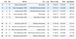
laps_result = pd.DataFrame()
# get tables from webs
for laps_web in fastest_laps_list:
source = urllib.request.urlopen(laps_web)
soup = bs.BeautifulSoup(source,'lxml')
table = soup.find_all('table')[0]
data = pd.read_html(str(table), flavor='bs4', header=[0])[0]
laps_result = pd.concat([data_laps_result,data]).round(2)
laps_result.drop(["Race","Unnamed: 0","Unnamed: 9"],axis=1,inplace=True)
laps_result
# Figure Size
fig, ax = plt.subplots(figsize =(16, 9))

# Horizontal Bar Plot
ax.barh(laps_result.sort_values(by='Avg Speed',ascending=True)['Driver'],
       laps_result.sort_values(by='Avg Speed',ascending=True)['Avg Speed'])


# Add x, y gridlines
ax.grid(visible = True, color ='grey',
        linestyle ='-.', linewidth = 0.5,
        alpha = 0.2)

# Show top values
ax.invert_yaxis()

# Add annotation to bars
for i in ax.patches:
    plt.text(i.get_width()+0.2, i.get_y()+0.5,
             str(round((i.get_width()), 2)),
             fontsize = 10, fontweight ='bold',
             color ='grey')

# Add Plot Title

plt.ylabel('Driver',fontsize = 15)
plt.xlabel('Average Speed',fontsize = 15)
plt.title('Average Speed of Drivers',fontsize =18)

# Show Plot
plt.savefig('3_average speed of drivers.jpg',dpi = 200, bbox_inches = 'tight')
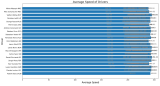
我希望能够让数值以avg speed的大小顺序排列,并且在尾端出现top value。但为什么sort_value没有实现排序,以及出现了大量的灰色数值小字?
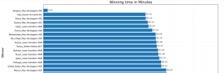
我原本想达成的效果是下面这样的图,我前后比照了下代码似乎没有差别,不知道为什么生成出来的图却不一样。