body {
transform-style: preserve-3d;
perspective: 500px;
}
    .box {
        position: relative;
        width: 200px;
        height: 200px;
        margin: 100px auto;
        transition: all 0.5s;
        transform-style: preserve-3d;
    }

    .box:hover {
        transform: rotateY(180deg);
    }

    .front,
    .back {
        position: absolute;
        top: 0;
        left: 0;
        width: 100%;
        height: 100%;
        border-radius: 50%;
        text-align: center;
        line-height: 200px;
        color: #fff;
        font-size: 50px;
    }

    .front {
        background-color: red;
        z-index: 1;
    }

    .back {
        background-color: pink;
        transform: rotateY(180deg);
    }
你好
打工人
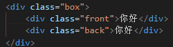
对应的html和css代码部分,3d转换实现鼠标经过切换两面翻转,为什么我这边转过来不会实现预期的效果