


希望大家帮我看看哈,问AI它有的也回答得乱七八糟的,实在是这门没学会

 分享
分享
 关注
关注让【宝码香车】来帮你解答,本回答参考DeepSeek编写,并整理提供。
如果还有疑问可以点击头像关注私信或评论。如果答案让您满意,请采纳、点赞、关注,非常感谢!
根据您提供的图片和需求,我理解您需要创建一个化妆品公司的网页,包含新闻、产品展示、公司理念等模块。以下是完整的HTML+CSS3实现方案:
<!DOCTYPE html>
<html lang="zh-CN">
<head>
<meta charset="UTF-8">
<meta name="viewport" content="width=device-width, initial-scale=1.0">
<title>上海化妆品有限公司</title>
<link rel="stylesheet" href="style.css">
</head>
<body>
<header>
<div class="logo">
<h1>HERBORIST</h1>
<p>中国智慧,全球时尚</p>
</div>
<nav>
<ul>
<li><a href="#">首页</a></li>
<li><a href="#">公司新闻</a></li>
<li><a href="#">产品中心</a></li>
<li><a href="#">公司理念</a></li>
<li><a href="#">联系我们</a></li>
</ul>
</nav>
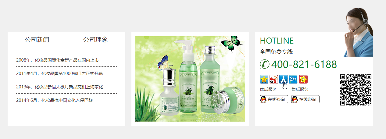
<div class="hotline">
<p>全国免费专线</p>
<p>400-821-6188</p>
</div>
</header>
<main>
<section class="banner">
<img src="banner.jpg" alt="公司大楼">
</section>
<section class="news">
<h2>公司新闻</h2>
<div class="timeline">
<div class="event">
<h3>2008年</h3>
<p>国际化全新产品在国内上市</p>
</div>
<div class="event">
<h3>2011年4月</h3>
<p>国内第1000家门店正式开幕</p>
</div>
<div class="event">
<h3>2013年</h3>
<p>新品太极丹亮相上海家化</p>
</div>
</div>
</section>
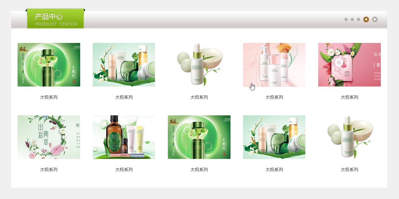
<section class="products">
<h2>太极系列产品</h2>
<div class="product-grid">
<div class="product-item">太极系列1</div>
<div class="product-item">太极系列2</div>
<div class="product-item">太极系列3</div>
<div class="product-item">太极系列4</div>
<div class="product-item">太极系列5</div>
</div>
</section>
<section class="about">
<h2>公司理念</h2>
<p>上海化妆品有限公司是上海家化联合股份有限公司的全资子公司,拥有近3000万的固定资产...</p>
</section>
</main>
<footer>
<p>©上海化妆品有限公司版权所有 沪ICP备11049051号</p>
</footer>
</body>
</html>
/* 基础样式 */
body {
    font-family: 'Microsoft YaHei', sans-serif;
    margin: 0;
    padding: 0;
    color: #333;
    line-height: 1.6;
}

header {
    background: #fff;
    box-shadow: 0 2px 10px rgba(0,0,0,0.1);
    padding: 15px 0;
    display: flex;
    justify-content: space-between;
    align-items: center;
}

.logo h1 {
    color: #8B4513;
    margin: 0;
    font-size: 28px;
}

nav ul {
    display: flex;
    list-style: none;
    margin: 0;
    padding: 0;
}

nav li {
    margin: 0 15px;
}

nav a {
    text-decoration: none;
    color: #333;
    font-weight: bold;
    transition: color 0.3s;
}

nav a:hover {
    color: #8B4513;
}

.hotline {
    background: #8B4513;
    color: white;
    padding: 8px 15px;
    border-radius: 4px;
    text-align: center;
}

/* 主要内容区 */
.banner img {
    width: 100%;
    height: auto;
}

section {
    padding: 40px 0;
}

h2 {
    text-align: center;
    color: #8B4513;
    margin-bottom: 30px;
    font-size: 28px;
}

/* 时间线样式 */
.timeline {
    position: relative;
    max-width: 800px;
    margin: 0 auto;
}

.event {
    background: #f9f9f9;
    padding: 20px;
    margin: 20px 0;
    border-left: 4px solid #8B4513;
    position: relative;
}

.event h3 {
    margin-top: 0;
    color: #8B4513;
}

/* 产品网格 */
.product-grid {
    display: grid;
    grid-template-columns: repeat(5, 1fr);
    gap: 15px;
    max-width: 1200px;
    margin: 0 auto;
}

.product-item {
    background: #f5f5f5;
    padding: 20px;
    text-align: center;
    transition: transform 0.3s;
}

.product-item:hover {
    transform: translateY(-5px);
    box-shadow: 0 5px 15px rgba(0,0,0,0.1);
}

/* 页脚 */
footer {
    background: #333;
    color: white;
    text-align: center;
    padding: 20px 0;
    margin-top: 40px;
}

/* 响应式设计 */
@media (max-width: 768px) {
    header {
        flex-direction: column;
    }

    nav ul {
        flex-direction: column;
        align-items: center;
    }

    .product-grid {
        grid-template-columns: repeat(2, 1fr);
    }
}
响应式导航栏:
@media (max-width: 768px) {
 nav ul {
     flex-direction: column;
 }
}
产品悬停效果:
.product-item:hover {
 transform: translateY(-5px);
 box-shadow: 0 5px 15px rgba(0,0,0,0.1);
}
时间线设计:
.event {
 border-left: 4px solid #8B4513;
 position: relative;
}
index.htmlstyle.css在同一目录banner.jpgproduct-item为:<div class="product-item">
<img src="product1.jpg" alt="太极系列1">
<p>太极系列1</p>
</div>
这个模板包含了您图片中展示的主要元素:公司新闻时间线、产品展示、公司理念和联系方式。您可以根据实际需要调整内容和样式。如需进一步修改或有任何问题,请随时告知!
分享 系统已结题
5月21日
系统已结题
5月21日 已采纳回答
5月13日
创建了问题
5月12日
已采纳回答
5月13日
创建了问题
5月12日

