douyi4544 2018-07-07 21:19
浏览 63
已采纳

自定义菜单,包含浮动文本和不对称边

I'd like to make a menu for my website that looks like this image. enter image description here

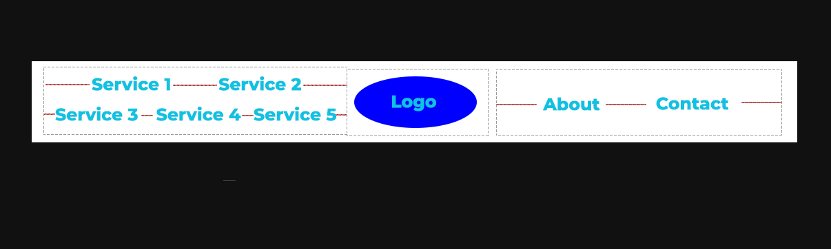
I want essentially three sections of the menu: a centered logo, a left side of menu items, and a right side of menu items. The dotted boxes denote those sections.

On the left section, I need two rows of menu items, that have even spacing dependent on the size of the box (spacing denoted by red lines). The spacing is also the same on the right section.

If someone could point me in the right direction or provide html/css, it would be very appreciated!

  • 写回答

2条回答 默认 最新

  • duanmi8349 2018-07-07 23:21
    关注

    A better solution using only flexbox:

    https://codepen.io/seanstopnik/pen/b5a8294dae7969c4c9fa7cfca470626c

    HTML:

    <header class="global-header" role="banner">
      <nav class="global-nav" role="navigation">
        <ul class="list global-nav__list">
          <li class="list__item global-nav__list-item"><a class="global-nav__link" href="">Service 1</a></li>
          <li class="list__item global-nav__list-item"><a class="global-nav__link" href="">Service 2</a></li>
          <li class="list__item global-nav__list-item"><a class="global-nav__link" href="">Service 3</a></li>
          <li class="list__item global-nav__list-item"><a class="global-nav__link" href="">Service 4</a></li>
          <li class="list__item global-nav__list-item"><a class="global-nav__link" href="">Service 5</a></li>
        </ul>
        <a class="global-nav__logo" href="/"></a>
        <ul class="list global-nav__list">
          <li class="list__item global-nav__list-item"><a class="global-nav__link" href="">About</a></li>
          <li class="list__item global-nav__list-item"><a class="global-nav__link" href="">Contact</a></li>
        </ul>
      </nav>
    </header>
    

    CSS:

    .global-header {
      background-color: #fff;
      padding: 10px;
    }
    
    .global-nav {
      display: flex;
      justify-content: space-around;
    }
    
    .global-nav__list {
      display: flex;
      width: 100%;
      height: 70px;
      flex-wrap: wrap;
      align-items: center;
    }
    .global-nav__list .global-nav__list-item {
      position: relative;
      flex: 1;
      text-align: center;
    }
    .global-nav__list .global-nav__list-item:nth-child(1), .global-nav__list .global-nav__list-item:nth-child(2) {
      flex: 0 0 50%;
    }
    .global-nav__list .global-nav__list-item:before {
      position: absolute;
      top: 50%;
      left: 0;
      width: 100%;
      height: 1px;
      background-color: red;
      content: '';
    }
    
    .global-nav__link {
      position: relative;
      display: inline-block;
      color: #3cc7e3;
      background-color: #fff;
      padding: 0 6px;
      z-index: 1;
    }
    .global-nav__link:hover {
      color: #222;
    }
    
    .global-nav__logo {
      flex: 0 0 200px;
      border-radius: 50%;
      background-color: blue;
      margin: 0 10px;
    }
    
    本回答被题主选为最佳回答 , 对您是否有帮助呢?
    评论
查看更多回答(1条)

报告相同问题?

悬赏问题

  • ¥15 安卓adb backup备份应用数据失败
  • ¥15 eclipse运行项目时遇到的问题
  • ¥15 关于#c##的问题:最近需要用CAT工具Trados进行一些开发
  • ¥15 南大pa1 小游戏没有界面,并且报了如下错误,尝试过换显卡驱动,但是好像不行
  • ¥15 没有证书,nginx怎么反向代理到只能接受https的公网网站
  • ¥50 成都蓉城足球俱乐部小程序抢票
  • ¥15 yolov7训练自己的数据集
  • ¥15 esp8266与51单片机连接问题(标签-单片机|关键词-串口)(相关搜索:51单片机|单片机|测试代码)
  • ¥15 电力市场出清matlab yalmip kkt 双层优化问题
  • ¥30 ros小车路径规划实现不了,如何解决?(操作系统-ubuntu)