
我的html、css、js分别存放在sections/timeline-section.liquid、assets/timeline-section.css、assets/timeline-section.js中。(具体见附注2
)此外我已经上传SVG资源:
timeline-drop.svg (水滴图标) 具体为:https://cdn.shopify.com/s/files/1/0078/6156/7570/files/wd-page-brand-story-time-line-drop-svg.png
timeline-arrow.svg (箭头图标) 具体为:https://cdn.shopify.com/s/files/1/0078/6156/7570/files/wd-page-brand-story-time-line-drop-angle-svg.png
timeline-line.svg (时间轴线) 具体为:https://cdn.shopify.com/s/files/1/0078/6156/7570/files/wd-brand-story-time-line-svg.png
并且确保在theme.liquid中已添加GSAP:
{{ 'https://cdnjs.cloudflare.com/ajax/libs/gsap/3.9.1/gsap.min.js' | script_tag | replace: '<script', '<script defer' }}
{{ 'https://cdnjs.cloudflare.com/ajax/libs/gsap/3.9.1/ScrollTrigger.min.js' | script_tag | replace: '<script', '<script defer' }}
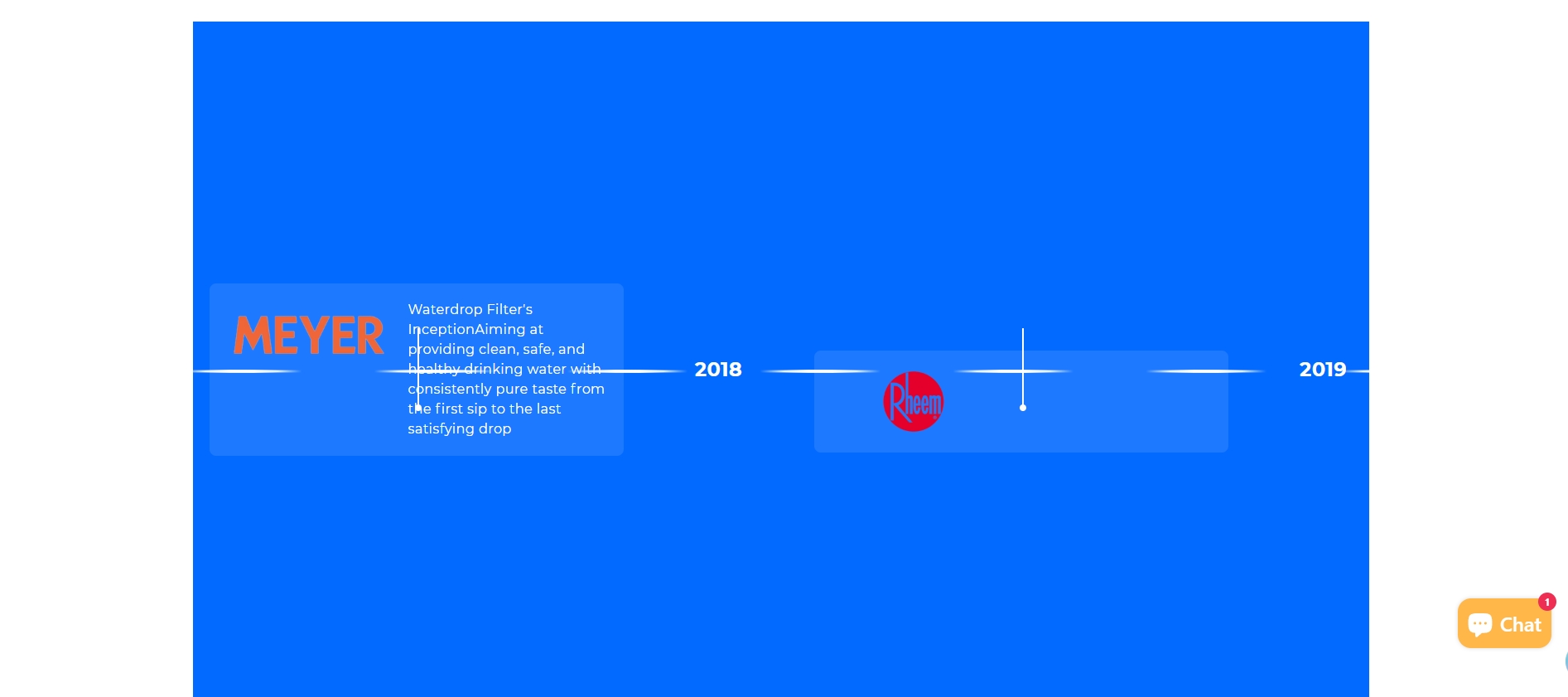
我是以爬取他人的网站为参考,想制作了一个展示品牌发展历程的时间轴模板,以供shopify商店开发者使用,以便设计时可以在后台直接填充品牌近年的一些经典数据、图片,展示品牌的的发展历程。但是实现的效果不是很理想(效果如截图)。
问题:
1.当前界面随着鼠标的上下滚动,页面直接较快的瞬移水平到最后,能否页面随鼠标上下滚动而水平缓慢移动,像爬取的参考网站一样。(有点类似拖拉水平滚动的感觉,只不过现在是随鼠标上下滚动而水平缓慢移动)
2.爬取网站的时间轴是一条长长的粗直线,我的效果图是断点的直线,需要改成连续的直线。
3.时间轴项目应该在时间轴下方一定的距离,或者在时间轴上方一定的距离,(最好先下后上,如爬取网站一样排列)然后通过一定的粗线和圆点连接。而不是现在和时间轴重合,应该是容器位置设计问题。(截图就是现在时间轴项目的样式和位置)
4.显然我实现的界面也没有填充整个屏幕感觉是shopify主题的限制。(我将我自己的网站用F12爬取的html放在附注3)
请基于该代码和参考网站,重新生成源代码,注意区分。(注意:不用一比一复制爬取的参考网站,可以参照,关键是实现效果)
附注:
1.我爬取的参考网站地址是:https://www.waterdropfilter.com/pages/brand-story?ref=headermenu
2.源代码如下:
{%- comment -%}
  Timeline section for brand story
{%- endcomment -%}

{{ 'timeline-section.css' | asset_url | stylesheet_tag }}

<div class="timeline-section" id="timeline-{{ section.id }}">
  <div class="timeline-container">
    <div class="pin-spacer">
      <div class="timeline-wrapper">
        <div class="timeline-contents">
          <!-- 左侧固定内容 -->
          <div class="timeline-side timeline-first">
            <div class="timeline-title">
              {{ section.settings.title_line1 }}<br>
              {{ section.settings.title_line2 }}
            </div>
            <div class="timeline-description">
              {{ section.settings.description }}
            </div>
            <div class="timeline-icon">
              <div class="drop-icon">
                <img alt="" loading="lazy" src="{{ 'timeline-drop.svg' | asset_url }}" class="drop-img">
                <img alt="" loading="lazy" src="{{ 'timeline-arrow.svg' | asset_url }}" class="arrow-icon">
              </div>
            </div>
          </div>

          <!-- 时间轴主体 -->
          <div class="timeline-items">
            <div class="timeline-items-line">
              <img alt="" loading="lazy" src="{{ 'timeline-line.svg' | asset_url }}" role="presentation">
            </div>

            {% for block in section.blocks %}
              {% case block.type %}
                {% when 'year' %}
                  <div class="timeline-year">
                    {% if block.settings.year_image %}
                      <img alt="{{ block.settings.year_alt }}" loading="lazy" src="{{ block.settings.year_image | img_url: '300x' }}">
                    {% else %}
                      <div class="placeholder-year">{{ block.settings.year_alt }}</div>
                    {% endif %}
                  </div>

                {% when 'item' %}
                  <div class="timeline-item {% if block.settings.position == 'top' %}item-top{% endif %}">
                    <div class="timeline-connector">
                      <div class="timeline-item-info-line"></div>
                    </div>
                    {% if block.settings.link != blank %}
                      <a href="{{ block.settings.link }}" class="timeline-item-link">
                    {% endif %}
                      <div class="timeline-item-content">
                        {% if block.settings.image %}
                          <div class="timeline-item-image">
                            <img alt="{{ block.settings.image_alt }}" loading="lazy" src="{{ block.settings.image | img_url: '300x' }}">
                          </div>
                        {% endif %}
                        <div class="timeline-item-text">
                          {% if block.settings.title != blank %}
                            <div class="timeline-item-title">
                              {{ block.settings.title }}
                            </div>
                          {% endif %}
                          <div class="timeline-item-description">
                            {{ block.settings.description }}
                          </div>
                        </div>
                      </div>
                    {% if block.settings.link != blank %}
                      </a>
                    {% endif %}
                  </div>
              {% endcase %}
            {% endfor %}
          </div>

          <!-- 右侧固定内容 -->
          <div class="timeline-side timeline-last">
            <div class="timeline-title">
              {{ section.settings.title_line1 }}<br>
              <span>{{ section.settings.title_line2 }}</span>
            </div>
            <div class="timeline-description">
              {{ section.settings.description }}
            </div>
            <div class="timeline-icon">
              <div class="drop-icon bottom-icon">
                <img alt="" loading="lazy" src="{{ 'timeline-drop.svg' | asset_url }}" class="drop-img">
                <img alt="" loading="lazy" src="{{ 'timeline-arrow.svg' | asset_url }}" class="arrow-icon">
              </div>
            </div>
          </div>
        </div>
      </div>
    </div>
  </div>
</div>

{% if section.blocks.size > 0 %}
  <script src="{{ 'timeline-section.js' | asset_url }}" defer="defer"></script>
{% endif %}

{% schema %}
{
  "name": "品牌时间轴",
  "tag": "section",
  "class": "section",
  "settings": [
    {
      "type": "text",
      "id": "title_line1",
      "label": "标题行1",
      "default": "Waterdrop"
    },
    {
      "type": "text",
      "id": "title_line2",
      "label": "标题行2",
      "default": "Filter's Growth"
    },
    {
      "type": "textarea",
      "id": "description",
      "label": "描述",
      "default": "Catch up on our progress in water purification area, consistently in pursuit of excellence, meaningful results, and a tech-focused emphasis since our inception."
    }
  ],
  "blocks": [
    {
      "type": "year",
      "name": "年份标记",
      "settings": [
        {
          "type": "image_picker",
          "id": "year_image",
          "label": "年份图片"
        },
        {
          "type": "text",
          "id": "year_alt",
          "label": "年份文本",
          "default": "2023"
        }
      ]
    },
    {
      "type": "item",
      "name": "时间轴项目",
      "settings": [
        {
          "type": "select",
          "id": "position",
          "label": "位置",
          "options": [
            {
              "value": "top",
              "label": "顶部"
            },
            {
              "value": "bottom",
              "label": "底部"
            }
          ],
          "default": "bottom"
        },
        {
          "type": "image_picker",
          "id": "image",
          "label": "图片"
        },
        {
          "type": "text",
          "id": "image_alt",
          "label": "图片替代文本"
        },
        {
          "type": "text",
          "id": "title",
          "label": "标题"
        },
        {
          "type": "richtext",
          "id": "description",
          "label": "描述"
        },
        {
          "type": "url",
          "id": "link",
          "label": "链接"
        }
      ]
    }
  ],
  "presets": [
    {
      "name": "品牌时间轴",
      "category": "自定义",
      "blocks": [
        {
          "type": "year",
          "settings": {
            "year_alt": "2015"
          }
        },
        {
          "type": "item",
          "settings": {
            "title": "品牌创立",
            "description": "<p>我们的品牌故事从这里开始</p>",
            "position": "bottom"
          }
        }
      ]
    }
  ]
}
{% endschema %}
/* 基础样式 */
.timeline-section {
  overflow: hidden;
  background: #036AFF;
  position: relative;
  padding: 0;
  margin: 0;
  width: 100%;
}

.timeline-container {
  width: 100%;
  height: auto;
  padding: 0;
  margin: 0;
}

.pin-spacer {
  width: 100% !important;
  height: auto !important;
  padding: 0 !important;
  margin: 0 !important;
}

.timeline-wrapper {
  height: 100vh;
  width: 100%;
  padding: 80px 0;
  margin: 0 auto;
  overflow: visible;
  position: relative;
}

.timeline-contents {
  display: flex;
  align-items: center;
  height: 100%;
  padding: 0 5%;
  position: relative;
  gap: 40px;
}

/* 侧边内容 */
.timeline-side {
  display: flex;
  flex-direction: column;
  justify-content: center;
  align-items: center;
  width: 300px;
  flex-shrink: 0;
  padding: 20px;
  box-sizing: border-box;
  text-align: center;
}

.timeline-title {
  color: #fff;
  font-family: Montserrat, sans-serif;
  font-size: 36px;
  font-weight: 600;
  line-height: 125%;
  margin-bottom: 24px;
}

.timeline-title span {
  font-size: 24px;
}

.timeline-description {
  color: #fff;
  font-family: Montserrat, sans-serif;
  font-size: 16px;
  font-weight: 400;
  line-height: 150%;
  margin-bottom: 24px;
}

.timeline-icon {
  cursor: pointer;
}

.drop-icon {
  position: relative;
  display: inline-block;
}

.drop-img {
  display: block;
}

.arrow-icon {
  position: absolute;
  top: 50%;
  left: 50%;
  transform: translate(-50%, -50%);
}

.bottom-icon {
  transform: rotate(180deg);
}

/* 时间轴主体 */
.timeline-items {
  position: relative;
  height: 100%;
  display: flex;
  align-items: center;
  flex-grow: 1;
  overflow: visible;
  gap: 40px;
}

/* 时间轴连接线 */
.timeline-items-line {
  height: 4px;
  width: 100%;
  background-color: #fff;
  position: absolute;
  top: 50%;
  left: 0;
  z-index: 0;
}

.timeline-items-line img {
  width: 100%;
  height: 100%;
}

.timeline-year {
  height: 100px;
  display: flex;
  align-items: center;
  justify-content: center;
  flex-shrink: 0;
  min-width: 150px;
  z-index: 1;
}

.timeline-year img {
  max-width: 150px;
  max-height: 80px;
  object-fit: contain;
}

.placeholder-year {
  color: white;
  font-size: 24px;
  font-weight: bold;
  font-family: Montserrat, sans-serif;
}

.timeline-item {
  min-height: 200px;
  display: flex;
  flex-direction: column;
  justify-content: flex-end;
  position: relative;
  flex-shrink: 0;
  min-width: 250px;
  z-index: 1;
}

.item-top {
  justify-content: flex-start;
}

.timeline-connector {
  position: absolute;
  top: 0;
  bottom: 0;
  left: 50%;
  width: 2px;
}

.timeline-item-info-line {
  position: absolute;
  height: 100px;
  width: 2px;
  background: #fff;
  top: 50%;
  transform: translateY(-50%);
  left: 50%;
}

.timeline-item-info-line::after {
  content: '';
  position: absolute;
  width: 8px;
  height: 8px;
  background: #fff;
  border-radius: 50%;
  bottom: 0;
  left: 50%;
  transform: translateX(-50%);
}

.item-top .timeline-item-info-line {
  top: 0;
  transform: none;
}

.item-top .timeline-item-info-line::after {
  top: 0;
  bottom: auto;
}

.timeline-item-content {
  display: flex;
  gap: 20px;
  opacity: 1;
  transform: none;
  background: rgba(255, 255, 255, 0.1);
  padding: 20px;
  border-radius: 8px;
}

.timeline-item-image img {
  max-width: 200px;
  max-height: 150px;
  object-fit: cover;
  border-radius: 8px;
}

.timeline-item-text {
  max-width: 300px;
}

.timeline-item-title {
  color: #fff;
  font-family: Montserrat, sans-serif;
  font-size: 20px;
  font-weight: 600;
  line-height: 125%;
  margin-bottom: 8px;
}

.timeline-item-description {
  width: 240px;
  color: #fff;
  font-family: Montserrat, sans-serif;
  font-size: 16px;
  font-weight: 400;
  line-height: 150%;
}

/* 响应式设计 */
@media screen and (max-width: 1280px) {
  .timeline-title {
    font-size: 32px;
  }

  .timeline-side {
    width: 250px;
  }
}

@media screen and (max-width: 1024px) {
  .timeline-wrapper {
    padding: 40px 0;
    overflow-x: scroll;
  }

  .timeline-contents {
    padding: 0 10px;
  }

  .timeline-title {
    font-size: 24px;
  }

  .timeline-item-title {
    font-size: 16px;
  }

  .timeline-item-description {
    font-size: 14px;
    width: 180px;
  }

  .timeline-items-line {
    opacity: 0;
  }
}

@media screen and (max-width: 767px) {
  .timeline-side {
    width: 220px;
  }

  .timeline-description {
    font-size: 14px;
  }

  .timeline-year img {
    width: 130px;
  }

  .timeline-item-image img {
    width: 180px;
  }
}
document.addEventListener('DOMContentLoaded', function() {
  // 确保GSAP已加载
  if (typeof gsap === 'undefined' || typeof ScrollTrigger === 'undefined') {
    console.error('GSAP or ScrollTrigger is not loaded. Timeline section requires these libraries.');
    return;
  }

  // 注册插件
  gsap.registerPlugin(ScrollTrigger);

  // 初始化时间轴
  function initTimeline() {
    const sections = document.querySelectorAll('.timeline-section');

    sections.forEach(section => {
      const timelineContent = section.querySelector('.timeline-contents');
      const timelineItems = section.querySelectorAll('.timeline-contents > *');

      if (!timelineContent || timelineItems.length === 0) return;

      // 计算总宽度
      let totalWidth = 0;
      timelineItems.forEach(item => {
        totalWidth += item.offsetWidth + 40; // 40px间隙
      });

      // 设置容器宽度
      timelineContent.style.width = `${totalWidth}px`;

      // 创建平滑滚动动画
      gsap.to(timelineContent, {
        x: () => -(timelineContent.scrollWidth - window.innerWidth),
        ease: "none",
        scrollTrigger: {
          trigger: section,
          start: "top top",
          end: "bottom bottom",
          scrub: 1.5, // 控制滚动平滑度
          pin: true,
          anticipatePin: 1
        }
      });
    });
  }

  // 初始化时间轴
  initTimeline();

  // 窗口大小变化时刷新
  window.addEventListener('resize', function() {
    ScrollTrigger.refresh();
    initTimeline();
  });
});


