
软件 HBuilder 5.01.2026021122-alpha
创建了uni-app x项目
uni-app x,
官方文档:https://doc.dcloud.net.cn/uni-app-x/
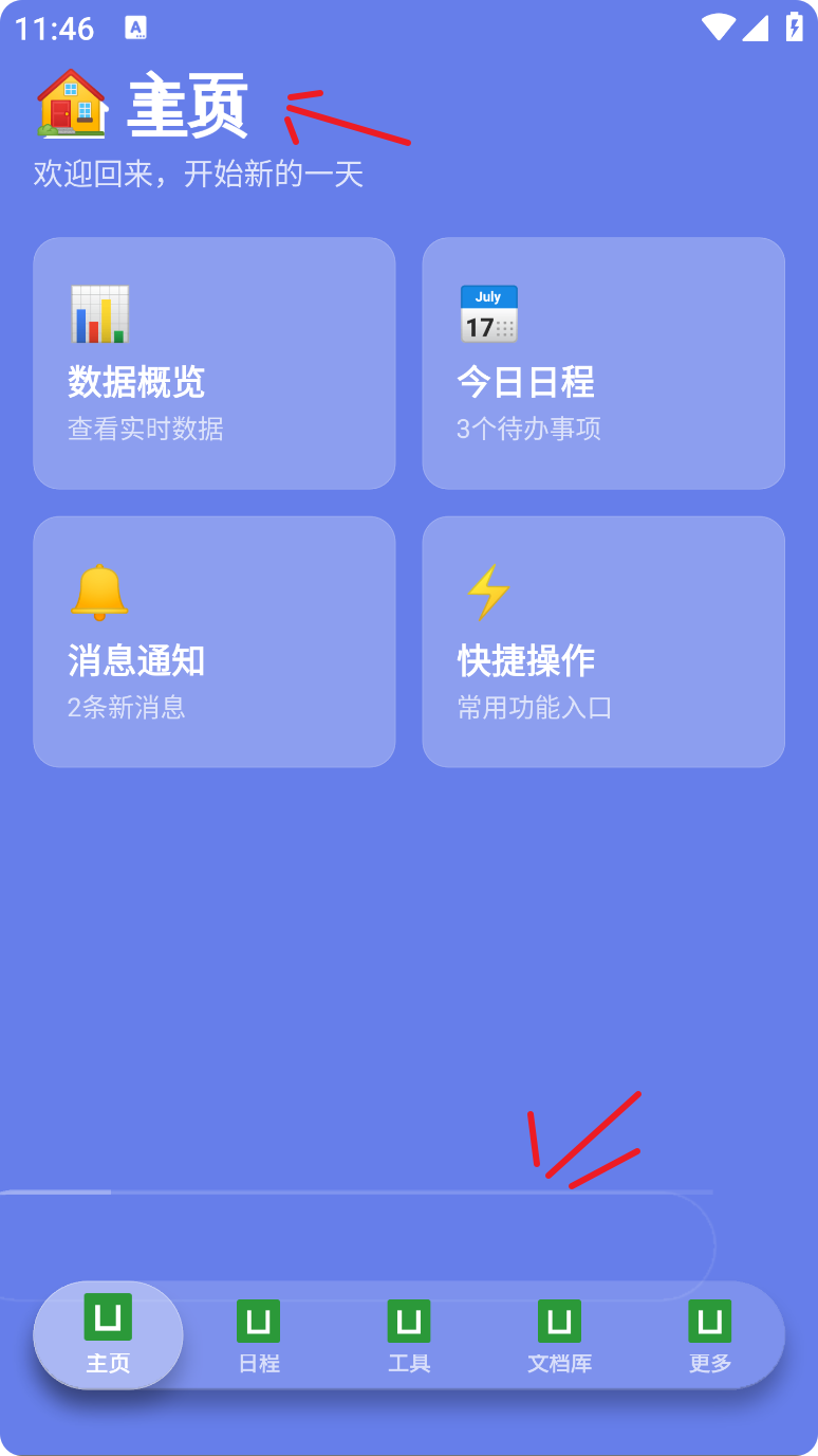
问题:项目运行在浏览器中正常显示,自定义的CustomTabBar组件点击切换都没有问题,但生成安卓APP测试时出现了文字重叠,错位的CustomTabBar边框,使用AI查询无果。
- 安卓APP异常页面
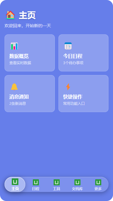
- 网页测试正常的页面
#主要文件
- pages/index/index.uvue (主页)
<template>
    <view
        class="page-container"
        :class="{ hidden: !isActive }"
    >
        <view
            class="page-content"
            :class="{
                'enter-active': animationState === 'enter',
                'exit-active': animationState === 'exit'
            }"
        >
            <view class="header">
                <view class="title-wrapper">
                    <text class="title">🏠 主页</text>
                </view>
                <text class="subtitle">欢迎回来,开始新的一天</text>
            </view>

            <scroll-view class="content-scroll" scroll-y>
                <view class="card-grid">
                    <view
                        class="glass-card"
                        v-for="(item, index) in features"
                        :key="index"
                        :class="{ 'last-in-row': (index % 2) === 1 }"
                    >
                        <text class="card-icon">{{ item.icon }}</text>
                        <text class="card-title">{{ item.title }}</text>
                        <text class="card-desc">{{ item.desc }}</text>
                    </view>
                </view>
                <view class="bottom-safe-area"></view>
            </scroll-view>
        </view>

        <CustomTabBar
            :current="0"
            @change="onTabChange"
            @beforeChange="onBeforeTabChange"
        />
    </view>
</template>

<script setup lang="uts">
import { ref, onMounted } from 'vue'
import { onShow, onHide } from '@dcloudio/uni-app'
import CustomTabBar from '@/components/CustomTabBar/CustomTabBar.uvue'

const ANIMATION_DURATION = 350

type FeatureItem = {
    icon: string
    title: string
    desc: string
}

type TabChangeEvent = {
    index: number
    tab: any
}

const features = ref<FeatureItem[]>([
    { icon: '📊', title: '数据概览', desc: '查看实时数据' },
    { icon: '📅', title: '今日日程', desc: '3个待办事项' },
    { icon: '🔔', title: '消息通知', desc: '2条新消息' },
    { icon: '⚡', title: '快捷操作', desc: '常用功能入口' }
])

const animationState = ref<'enter' | 'exit' | 'none'>('enter')
const isActive = ref(true)  // 控制页面显隐

onMounted(() => {
    console.log('index mounted')
    setTimeout(() => {
        animationState.value = 'none'
    }, 50)
})

onShow(() => {
    console.log('index onShow')
    isActive.value = true

    // 隐藏原生 tabBar(捕获异常)
    try {
        uni.hideTabBar({ animation: false })
    } catch (e) {
        console.log('hideTabBar error:', e)
    }

    if (animationState.value !== 'enter') {
        animationState.value = 'enter'
        setTimeout(() => {
            animationState.value = 'none'
        }, 50)
    }
})

onHide(() => {
    console.log('index onHide')
    isActive.value = false
})

const onBeforeTabChange = (targetIndex: number) => {
    console.log('onBeforeTabChange', targetIndex)
    if (targetIndex !== 0) {
        animationState.value = 'exit'
        setTimeout(() => {
            animationState.value = 'none'
        }, ANIMATION_DURATION)
    }
}

const onTabChange = (e: TabChangeEvent) => {
    console.log('Tab changed:', e)
}
</script>

<style scoped>
.page-container {
    position: absolute;
    top: 0;
    left: 0;
    right: 0;
    bottom: 0;
    display: flex;
    flex-direction: column;
    background: #667eea;
    padding: 60rpx 30rpx 0;
    box-sizing: border-box;
    z-index: 2;
}

.page-container.hidden {
    display: none;
}

.page-content {
    flex: 1;
    display: flex;
    flex-direction: column;
    min-height: 0;
    transition: all 0.35s ease-out;
    opacity: 1;
    transform: scale(1);
    transform-origin: center center;
}

.page-content.enter-active,
.page-content.exit-active {
    opacity: 0.75;
    transform: scale(0.75);
}

.header {
    margin-bottom: 40rpx;
    flex-shrink: 0;
}

.title-wrapper {
    display: flex;
    flex-direction: column;
    margin-bottom: 16rpx;
}

.title {
    font-size: 56rpx;
    font-weight: bold;
    color: #ffffff;
    text-shadow: 0 4rpx 10rpx rgba(0,0,0,0.2);
}

.subtitle {
    font-size: 28rpx;
    color: rgba(255,255,255,0.8);
}

.content-scroll {
    flex: 1;
    width: 100%;
    height: 100%;
}

.card-grid {
    display: flex;
    flex-direction: row;
    flex-wrap: wrap;
    justify-content: space-between;
}

.glass-card {
    width: 333rpx;
    margin-bottom: 24rpx;
    background: rgba(255, 255, 255, 0.25);
    border-radius: 24rpx;
    padding: 40rpx 30rpx;
    border: 1rpx solid rgba(255, 255, 255, 0.2);
    display: flex;
    flex-direction: column;
    align-items: flex-start;
    box-sizing: border-box;
}

.glass-card.last-in-row {
    margin-right: 0;
}

.glass-card:active {
    opacity: 0.8;
}

.card-icon {
    font-size: 48rpx;
    margin-bottom: 16rpx;
}

.card-title {
    font-size: 32rpx;
    font-weight: bold;
    color: #ffffff;
    margin-bottom: 8rpx;
}

.card-desc {
    font-size: 24rpx;
    color: rgba(255,255,255,0.7);
}

.bottom-safe-area {
    height: 180rpx;
}
</style>
- components/CustomTabBar/CustomTabBar.uvue(自定义组件,浮动tabBar)
<template>
    <view class="custom-tab-bar">
        <view class="tab-bar-wrapper" :style="{ paddingBottom: safeAreaBottom + 'px' }">
            <view class="tab-bar-outer">
                <view class="tab-bar">
                    <!-- 外层指示器:负责水平移动 -->
                    <view
                        class="active-indicator"
                        :style="moveStyle"
                    >
                        <!-- 内层指示器:负责缩放 -->
                        <view
                            class="indicator-inner"
                            :style="scaleStyle"
                        ></view>
                    </view>

                    <view class="tab-items-container">
                        <view
                            v-for="(tab, index) in tabList"
                            :key="tab.pagePath"
                            class="tab-item"
                            :class="{ active: currentIndex === index }"
                            @click="handleClick(index)"
                        >
                            <view class="tab-icon-wrapper">
                                <image
                                    class="tab-icon"
                                    :src="currentIndex === index ? tab.selectedIconPath : tab.iconPath"
                                    mode="aspectFit"
                                />
                            </view>
                            <text class="tab-label">{{ tab.text }}</text>
                        </view>
                    </view>
                </view>
            </view>
        </view>
    </view>
</template>

<script setup lang="uts">
import { ref, computed, onMounted } from 'vue'
import { onShow } from '@dcloudio/uni-app'

const ANIMATION_DURATION = 350

type TabItem = {
    pagePath: string
    text: string
    iconPath: string
    selectedIconPath: string
}

const safeAreaBottom = ref<number>(0)
const isScaling = ref<boolean>(false)
const currentIndex = ref<number>(0)

const props = defineProps<{
    current: number
}>()

const emit = defineEmits<{
    (e: 'change', payload: { index: number; tab: TabItem }): void
    (e: 'beforeChange', index: number): void
}>()

const tabList = ref<TabItem[]>([
    { pagePath: 'pages/index/index', text: '主页', iconPath: '/static/tabbar/home.png', selectedIconPath: '/static/tabbar/home-active.png' },
    { pagePath: 'pages/tabs/schedule/schedule', text: '日程', iconPath: '/static/tabbar/schedule.png', selectedIconPath: '/static/tabbar/schedule-active.png' },
    { pagePath: 'pages/tabs/tools/tools', text: '工具', iconPath: '/static/tabbar/tools.png', selectedIconPath: '/static/tabbar/tools-active.png' },
    { pagePath: 'pages/tabs/docs/docs', text: '文档库', iconPath: '/static/tabbar/docs.png', selectedIconPath: '/static/tabbar/docs-active.png' },
    { pagePath: 'pages/tabs/more/more', text: '更多', iconPath: '/static/tabbar/more.png', selectedIconPath: '/static/tabbar/more-active.png' }
])

const moveStyle = computed(() => ({
    transform: `translateX(${currentIndex.value * 100}%)`,
    transition: 'transform 0.35s cubic-bezier(0.0, 0.0, 0.2, 1)'
}))

const scaleStyle = computed(() => ({
    transform: `scale(${isScaling.value ? 1.08 : 1})`,
    transition: 'transform 0.35s cubic-bezier(0.23, 1, 0.32, 1)'
}))

const handleClick = (index: number) => {
    console.log('CustomTabBar clicked', index)
    if (index === currentIndex.value) return

    emit('beforeChange', index)

    isScaling.value = true
    currentIndex.value = index

    setTimeout(() => {
        isScaling.value = false
    }, ANIMATION_DURATION)

    setTimeout(() => {
        uni.switchTab({ url: '/' + tabList.value[index].pagePath })
    }, ANIMATION_DURATION)

    emit('change', {
        index: index,
        tab: tabList.value[index]
    })
}

onMounted(() => {
    const sys = uni.getSystemInfoSync()
    if (sys.safeAreaInsets != null) {
        safeAreaBottom.value = sys.safeAreaInsets.bottom
    }
    currentIndex.value = props.current
})

onShow(() => {
    console.log('CustomTabBar onShow', props.current)
    currentIndex.value = props.current
})
</script>

<style scoped>
.custom-tab-bar {
    position: fixed;
    bottom: 40rpx;
    left: 30rpx;
    right: 30rpx;
    z-index: 10000;
    overflow: visible;
    pointer-events: none;
}

.tab-bar-wrapper {
    padding-bottom: 30rpx;
    overflow: visible;
    pointer-events: none;
}

.tab-bar-outer {
    position: relative;
    width: 100%;
    height: 100rpx;
    margin: 20rpx 0;
    overflow: visible;
    pointer-events: auto;
}

.tab-bar {
    position: relative;
    width: 100%;
    height: 100%;
    background: rgba(255, 255, 255, 0.15);
    border-radius: 50rpx;
    box-shadow:
        0 8rpx 32rpx rgba(0, 0, 0, 0.3),
        inset 0 2rpx 0 rgba(255, 255, 255, 0.3),
        0 0 0 1rpx rgba(255, 255, 255, 0.1);
    overflow: visible;
}

.active-indicator {
    position: absolute;
    left: 0;
    top: 0;
    width: 20%;
    height: 100rpx;
    z-index: 0;
    pointer-events: none;
    overflow: visible;
}

.indicator-inner {
    width: 100%;
    height: 100%;
    background: rgba(255, 255, 255, 0.35);
    border-radius: 50rpx;
    box-shadow:
        0 8rpx 32rpx rgba(0, 0, 0, 0.25),
        inset 0 2rpx 0 rgba(255, 255, 255, 0.5);
    border: 1rpx solid rgba(255, 255, 255, 0.4);
    transform-origin: center center;
}

.tab-items-container {
    position: relative;
    width: 100%;
    height: 100%;
    display: flex;
    flex-direction: row;
    justify-content: space-around;
    align-items: center;
    z-index: 2;
}

.tab-item {
    display: flex;
    flex-direction: column;
    align-items: center;
    justify-content: center;
    height: 100%;
    flex: 1;
    position: relative;
    transition: transform 0.2s ease;
}

.tab-icon-wrapper {
    width: 48rpx;
    height: 48rpx;
    margin-bottom: 6rpx;
    display: flex;
    align-items: center;
    justify-content: center;
    transition: transform 0.3s ease;
}

.tab-icon {
    width: 40rpx;
    height: 40rpx;
    transition: transform 0.3s ease;
}

.tab-label {
    font-size: 20rpx;
    font-weight: bold;
    color: rgba(255, 255, 255, 0.7);
    line-height: 1;
    white-space: nowrap;
    transition: all 0.3s ease;
}

.tab-item.active .tab-icon-wrapper {
    transform: translateY(-4rpx);
}

.tab-item.active .tab-icon {
    transform: scale(1.1);
}

.tab-item.active .tab-label {
    color: #ffffff;
    font-weight: 700;
    transform: scale(1.05);
}

.tab-item:active {
    opacity: 0.8;
    transform: scale(0.95);
}
</style>
- 在根目录的App.uvue
<template>
    <view class="app">
        <router-view></router-view>
    </view>
</template>

<script lang="uts">
    // #ifdef APP-ANDROID || APP-HARMONY
    let firstBackTime = 0
    // #endif
    export default {
        onLaunch() {
            console.log('App Launch')
        },
        onShow() {
            console.log('App Show')
        },
        onHide() {
            console.log('App Hide')
        },
        // #ifdef APP-ANDROID || APP-HARMONY
        onLastPageBackPress() {
            console.log('App LastPageBackPress')
            if (firstBackTime == 0) {
                uni.showToast({
                    title: '再按一次退出应用',
                    position: 'bottom',
                })
                firstBackTime = Date.now()
                setTimeout(() => {
                    firstBackTime = 0
                }, 2000)
            } else if (Date.now() - firstBackTime < 2000) {
                firstBackTime = Date.now()
                uni.exit()
            }
        },
        // #endif
        onExit() {
            console.log('App Exit')
        },
    }
</script>

<style>
    .app {
        background-color: transparent;
    }
</style>
- main.uts
import App from './App.uvue'

import { createSSRApp } from 'vue'

// 全局注册组件
// import GlassTabBar from './components/GlassTabBar/GlassTabBar.uvue'

export function createApp() {
    const app = createSSRApp(App)
    // 全局注册
    // app.component('GlassTabBar', GlassTabBar)
    return {
        app
    }
}
- pages.json
{
  "pages": [
    {
      "path": "pages/index/index",
      "style": {
        "navigationStyle": "custom"
      }
    },
    {
      "path": "pages/tabs/schedule/schedule",
      "style": {
        "navigationStyle": "custom"
      }
    },
    {
      "path": "pages/tabs/tools/tools",
      "style": {
        "navigationStyle": "custom"
      }
    },
    {
      "path": "pages/tabs/docs/docs",
      "style": {
        "navigationStyle": "custom"
      }
    },
    {
      "path": "pages/tabs/more/more",
      "style": {
        "navigationStyle": "custom"
      }
    }
  ],
  "globalStyle": {
    "navigationBarTextStyle": "white",
    "navigationBarBackgroundColor": "#667eea",
    "backgroundColor": "#667eea"
  },
  "tabBar": {
    "custom": true,
    "color": "#999999",
    "selectedColor": "#667eea",
    "backgroundColor": "transparent",
    "borderStyle": "black",
    "list": [
      { "pagePath": "pages/index/index", "text": "主页" },
      { "pagePath": "pages/tabs/schedule/schedule", "text": "日程" },
      { "pagePath": "pages/tabs/tools/tools", "text": "工具" },
      { "pagePath": "pages/tabs/docs/docs", "text": "文档库" },
      { "pagePath": "pages/tabs/more/more", "text": "更多" }
    ]
  },
  "uniIdRouter": {},
  "condition": {
    "current": 0,
    "list": []
  }
}
- 更目录下的index.html
<!DOCTYPE html>
<html lang="zh-CN">
    <head>
        <meta charset="UTF-8" />
        <script>
            var coverSupport = 'CSS' in window && typeof CSS.supports === 'function' && (CSS.supports('top: env(a)') ||
                CSS.supports('top: constant(a)'))
            document.write(
                '<meta name="viewport" content="width=device-width, user-scalable=no, initial-scale=1.0, maximum-scale=1.0, minimum-scale=1.0' +
                (coverSupport ? ', viewport-fit=cover' : '') + '" />')
        </script>
        <title></title>
        <!--preload-links-->
        <!--app-context-->
    </head>
    <body>
        <div id="app"><!--app-html--></div>
        <script type="module" src="/main"></script>
    </body>
</html>


