import pandas as pd
# noinspection PyUnresolvedReferences
import numpy as np
import os
# noinspection PyUnresolvedReferences
import matplotlib.pyplot as plt
# noinspection PyUnresolvedReferences
from sklearn.linear_model import LinearRegression
#input the excel file address and the data to be plotted.
#refer to the excel header for groupKey, LocXKey, LocYKey, valueXKey and valueKKey.
fileAdd_x = r"C:\Users\z\PycharmProjects\Test\Excel\Material\X.Meas.csv"
fileAdd_y = r"C:\Users\z\PycharmProjects\Test\Excel\Material\Y.Meas.csv"
groupKey = 'WorkSet'
#data import
data_x = pd.read_csv(fileAdd_x).dropna( how = 'all' )
data_y = pd.read_csv(fileAdd_y).dropna( how = 'all' )
groups_x = data_x[ groupKey ].unique()
groups_y = data_y[ groupKey ].unique()
##################################################################################################
S=[13,7,15,18,19]
labels = S
x = np.arange(len(labels)) # the label locations
width = 0.35 # the width of the bars
######### Correlation #########
fig_Correlation,ax = plt.subplots()
for group in groups_x:
groupIndex = data_x[ groupKey ] == group
groupData_x = data_x[ groupIndex ]
x1 = groupData_x['X_Meas']
y1 = groupData_x['X']
#print(x1)
# 将 x,y 分别增加一个轴,以满足 sklearn 中回归模型认可的数据
x1 = x1[:, np.newaxis]
y1 = y1[:, np.newaxis]
model = LinearRegression() # 构建线性模型
model.fit(x1, y1) # Overlayx自变量在前,因变量在后
R2_X = model.score(x1, y1) # 拟合程度 x R2
print('R2_x = %.3f' % R2_X) # 输出 R2
rects5 = ax.bar(x - width/2, R2_X , width, label='X_Rsq')
for group in groups_y:
groupIndex = data_y[ groupKey ] == group
groupData_y = data_y[ groupIndex ]
x2 = groupData_y['Y_Meas']
y2 = groupData_y['Y']
# 将 x,y 分别增加一个轴,以满足 sklearn 中回归模型认可的数据
x2 = x2[:, np.newaxis]
y2 = y2[:, np.newaxis]
model = LinearRegression() # 构建线性模型
model.fit(x2, y2) # Overlayx自变量在前,因变量在后
R2_Y = model.score(x2, y2) # 拟合程度 y R2
print('R2_y = %.3f' % R2_Y) # 输出 R2
rects6 = ax.bar(x + width/2, R2_Y , width, label='Y_Rsq')
######### Graph Correlation #########
# Add some text for labels, title and custom x-axis tick labels, etc.
ax.set_xticks(x)
ax.set_xticklabels(labels)
ax.set_ylim((0,1.3)) #定义y轴的取值范围
ax.legend()
def autolabel(rects):
# attach some text labels
for rect in rects:
height = rect.get_height()
ax.text(rect.get_x()+rect.get_width()/2.0, 1.0*height,
'%.3f'%float(height), ha='center', va='bottom')
#‘%.2f’%float(height)这个设置是让显示的数值精度为小数点后两位小数
autolabel(rects5)
autolabel(rects6)
fig_Correlation.tight_layout()
#plt.savefig('./RMSE.jpg') #把图片保存在当前路径下,必须放在plt.show()之前,否则将是空白
plt.show()**实际

**
想法


显示和理想的差距。。For循环逻辑上哪里出错了吗?

- 写回答
- 好问题 0 提建议
- 追加酬金
- 关注问题
 分享
分享- 邀请回答
-


2条回答 默认 最新
-
 关注
关注主要在俩个问题:绘图的时候传参数值不对;刻度太大,值差别太小,所以看不出来。

import matplotlib.pyplot as plt
import numpy as np
from matplotlib import ticker

S = [13, 7, 15, 18, 19]
labels = S
x = np.arange(len(labels))  # the label locations
width = 0.35  # the width of the bars

fig_Correlation, ax = plt.subplots()
zsx = [0.999, 0.999, 0.998, 0.998, 0.998]
zsy = [0.998, 0.998, 0.997, 0.998, 0.998]
ax.bar(x - width / 2, zsx, width, label='X_Rsq')
ax.bar(x + width / 2, zsy, width, label='Y_Rsq')
ax.set_xticks(x)
ax.set_xticklabels(labels)
ax.set_ylim((0.8, 1.0))  # 定义y轴的取值范围
ax.yaxis.set_major_locator(ticker.MultipleLocator(0.01)) # y轴刻度
ax.yaxis.set_minor_locator(ticker.MultipleLocator(0.001))  # y最小刻度精度
ax.legend()
plt.show()
本回答被题主选为最佳回答 , 对您是否有帮助呢?评论 打赏解决 1无用举报 分享 1 人已打赏
- 2022-04-12 18:00回答 2 已采纳 print缩进一下即可 import os path="E:\Game" files=os.listdir(path) y=[] for file in files: position=path+
- 2019-05-09 09:07回答 5 已采纳 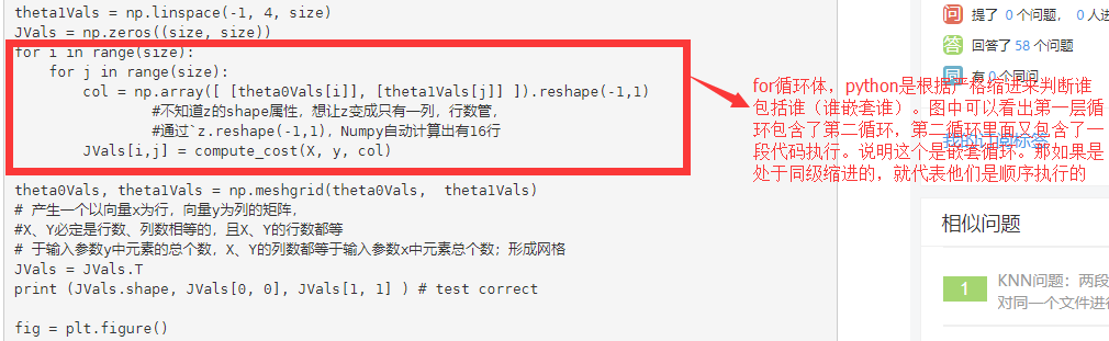
- 2022-05-05 08:53回答 1 已采纳 1.嵌套循环中,外循环循环一次,内循环循环完成2.并列循环中,先完成前面的循环,再完成后面的
- 2024-01-02 17:19网罗开发的博客 pyQuil 一直是在 Rigetti 量子处理单元(QPUs)上构建和运行量子程序的基石,通过我们的 Quantum Cloud Services(QCS™)平台提供服务。它是我们的一个重要客户端库。然而,随着 QCS 平台的发展,我们越来越倾向于...
- 2022-05-07 21:06回答 1 已采纳 if f in fruit: fruit.remove(f) print(*fruit) else: fruit.append(f) print(*fruit)
- 2022-05-07 23:01回答 2 已采纳 def maxnum(lst): maxn = 0 i = 0 while i<len(lst): if maxn < lst[i]:
- 2022-02-13 17:43回答 3 已采纳 agent = {'number': '1001', 'agent_name': ['one', 'two', 'three'], 'agent_city': [
- 2021-01-14 09:47追风的树叶的博客 0引言软件测试是保障和提高软件质量的重要手段[1]。软件开发者和使用者必须对软件进行充分的测试,以确保其正常工作。统计表明,在典型的软件开发项目中,软件测试工作量往往占软件开发总工作量的40%以上[2,3]。...
- 2022-04-25 09:41回答 3 已采纳 if datas[i]==最佳匹配[0]:在递归调用后, 加一行break不然就会在你递归完成后, 继续循环, 访问错误的index
- 2023-02-06 09:49回答 4 已采纳 h是一个生成器对象,在python中,生成器对象中的数据通过for循环在取完里面所有的数据后,这是生成器对象的长度就变成了0,也就是里面没有数据了。所以后面的for循环就会什么数据也显示不出来。如果要
- 2022-04-03 09:50回答 2 已采纳 favorite_languages={ 'Mike':['Java',20], 'Tracy':['C++',21], 'Jack':['Python',19], } for name,lang
- 2024-04-20 23:27苹果Android开发组的博客 编程语言是用来控制计算机的一系列指令(Instruction),它有固定的格式和词汇(不同编程语言的格式和词汇不一样),必须遵守,否则就会出错,达不到我们的目的。习惯上,我们将这一条条指令称为代码,这些代码共同组成...
- 2022-03-16 20:16回答 3 已采纳 letter = ['A','B','C','D','D','D'] for i in letter: print("当前遍历\t", i,end="\t") if i == 'D
- 2024-03-15 10:30Amo Xiang的博客 本文主要介绍和 Python 编程相关的基础知识,并没有真正涉及 Python 语法,算是一道开胃菜。
- 2022-05-30 14:19天涯尽头黄鹤楼的博客 Python数据分析学习系列四 资料转自(GitHub地址):https://github.com/wesm/pydata-book 有需要的朋友可以自行去github下载 NumPy(Numerical Python的简称)是Python数值计算最重要的基础包。大多数提供科学计算...
- 没有解决我的问题, 去提问


问题事件
 系统已结题
8月24日
系统已结题
8月24日 已采纳回答
8月16日
已采纳回答
8月16日-
创建了问题
8月16日
悬赏问题
- ¥15 抖音咸鱼付款链接转码支付宝
- ¥15 ubuntu22.04上安装ursim-3.15.8.106339遇到的问题
- ¥15 求螺旋焊缝的图像处理
- ¥15 blast算法(相关搜索:数据库)
- ¥15 请问有人会紧聚焦相关的matlab知识嘛?
- ¥15 网络通信安全解决方案
- ¥50 yalmip+Gurobi
- ¥20 win10修改放大文本以及缩放与布局后蓝屏无法正常进入桌面
- ¥15 itunes恢复数据最后一步发生错误
- ¥15 关于#windows#的问题:2024年5月15日的win11更新后资源管理器没有地址栏了顶部的地址栏和文件搜索都消失了