
I am kind of a newbie on CSS and can't get my grid layout to work properly. I suspect that is has to do with the php WP_Query request because all my recent posts show up vertically in just one column of the grid.
I want them to display in 3 columns and 2 rows. I've tried everything and my code just keeps on getting messier..
Is there an easy way to do this?
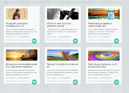
This is how I want it to look:
my index.php code:
    <?php get_header(); ?>
<div class="main">
  <div id="content">
    <!--    <div id="featuredPosts">-->
      <div class="item">
      </div>
      <div class="lastItem">
      </div>
    </div>-->
    <div class="grid-container">

      <?php $the_query = new WP_Query( 'posts_per_page=6' ); ?>
      <!--// Start our WP Query-->
      <?php while ($the_query -> have_posts()) : $the_query -> the_post(); ?>
      <!--     // Display the Post Title with Hyperlink-->
      <div class="grid-item">
        <article>
          <a href="<?php the_permalink() ?>">
            <?php the_title(); ?>
          </a>
          <!--      // Display the Post Excerpt-->
          <?php the_excerpt(__('(more…)')); ?>
          <!--      Repeat the process and reset once it hits the limit-->
        </article>
        <?php
endwhile;
wp_reset_postdata();
?>
      </div>
    </div>
    <?php get_sidebar(); ?>
    <?php get_footer(); ?>
my css code:
* {
  margin: 0;
  padding: 0;
}

footer,
header,
nav,
  {
  display: block;
}

article {
  display: grid;
}

body,
html {}

#outer-wrapper {
  background-image: url(assets/Organizer2.jpg);
  min-height: 100%;
  width: 100%;
  /*  overflow: hidden;*/
  background-repeat: no-repeat;
  background-size: cover;
  background-position: center;
}

#inner-wrapper {
  display: block;
  border: 3px solid white;
}

.main {
  background: white;
  padding: 10px;
  margin: 100px;
  /*  display: grid;*/
  border: 2px solid white;
  border-radius: 10px;
}


header {
  /*  background: url(assets/Stina%20Smeds%20-%20Developer.png);*/
  /*
    background-repeat: no-repeat;
  background-size: contain;
  background-position: center;
  -webkit-background-size: cover;
  -moz-background-size: cover;
*/
  /*  o-background-size: cover;*/
  /*  padding: 15%;*/
  /*  width: 100%;*/
  height: 200px;
  /*  margin: auto 0;*/
}

#header h1 {
  font-size: 70px;
  margin: auto;
  padding: 20px 0 10px 20px;
  text-shadow: -3px 3px 6px #FFF;
}

#header p {
  font-size: 30px;
  font-weight: bold;
  margin: 0 auto;
  padding: 0 0 20px 20px;
}

nav ul {
  list-style-type: none;
  margin: 0;
  padding: 0;
  overflow: hidden;
  background-color: #333;
}

nav li {
  float: left;
}

nav li a {
  display: block;
  color: #ffe6ff;
  text-align: center;
  padding: 14px 16px;
  text-decoration: none;
}

nav li a:hover {
  background-color: #29293d;
}

aside {
  padding: 0 20px 0 20px;
  float: right;
}

.aside-ul {
  display: inline-block;
  list-style-type: none;
  font-size: 30px;
  padding: 5px;
  border: 1px solid white;
  border-radius: 10px;
}

#content {
  padding-bottom: 20px;
  display: grid;
  grid-gap: 1rem;
  grid-template-columns: 1fr 1fr 1fr;
  grid-template-rows: 1fr 1fr 1fr;
  grid-auto-flow: column;
  /*  overflow: hidden;*/
  /*  margin-top: 25px;*/
  /*  display: grid;*/
  /*  text-align: center;*/
}

/*
#content ul {
  list-style-type: none;
}
*/

#content article {
  margin-bottom: 20px;
  padding-bottom: 20px;
}

.grid-container {
  /*
  display: grid;
  grid-gap: 1rem;
  grid-template-columns: 1fr 1fr 1fr;
  grid-template-rows: 1fr 1fr 1fr;
*/
  /*  height: 200px;*/
  /*  width: 200px;*/
  /*  display: grid;*/
  /*  grid-template-columns: 1fr 1fr 1fr;*/
  /*  grid-template-rows: repeat(3, 1fr) repeat(3, 1fr);*/
  /*  grid-auto-flow: row;*/
  /*  grid: 270px 270px / repeat(4, 270px);*/
  /*  justify-content: center;*/
  /*  grid-gap: 10px;*/
  /*  padding: 10px;*/
  /*  border: 1px solid blue;*/
}

/*
.grid-item {
  border: solid 1px black;
  grid-auto-flow: column;

  grid-column: 2/3;

  grid-row: 1/3;

}
*/

.fa {
  /*  padding: 20px 20px 0 0;*/
  /*
  box-sizing: inherit;
  font-size: 70px;
*/
  color: #fea;
  text-shadow: -3px 3px 6px #79b4c2;
  width: 40px;
  text-align: center;
  text-decoration: none;

}

/* Add a hover effect if you want */

.fa:hover {
  opacity: 0.7;
}


hr {
  margin-top: 50px;
}

/*
#featuredPosts {
  margin-bottom: 30px;
  overflow: hidden;
}
*/

/*
#featuredPosts .item {
  float: left;
  margin-right: 15px;
  padding: 0 30px 30px 0;
  position: relative;
  width: 450px;
}
*/

/*
#featuredPosts .lastItem {
  margin-right: 0;
  padding-right: 0;
}
*/

/*
recentPosts {
  display: grid;
  list-style-type: none;
  float: left;
  padding: 3px;
  margin: 3px;
  border: 3px solid #eee;
}
*/

/*
#content article.postBox {
  float: left;
  margin: 0 42px 30px 0;
  padding-bottom: 5px;
  position: 4;
  text-shadow: none;
  width: 290px;
}
*/

/*
.bg {
  background-image: url(assets/body-background.jpg);
  width: 100%;
  height: 100%;
  overflow: hidden;
  background-repeat: no-repeat;
  background-size: cover;
}
*/
Thank you in advance!


