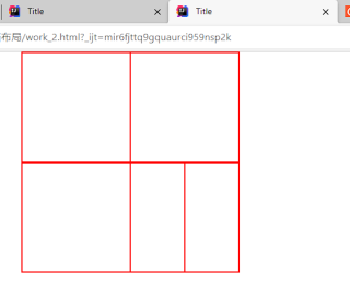
<!DOCTYPE html>
<html lang="en">
<head>
    <meta charset="UTF-8">
    <meta name="viewport" content="width = device -width"/>
    <title>Title</title>
    <link href="../css/bootstrap.css" rel="stylesheet">

    <style>
        .col-6 {
            width: 600px;
            height: 300px;
            border: solid red 1px;
        }
        .col-3{
            width: 600px;
            height:300px;
            border: solid red 1px;
        }
        .rows-6{

            height: 300px;
            border: solid red 1px;
        }
        .col{
            width: 600px;
            height: 300px;
            border: solid red 1px;
        }
        .row{
            width: 600px;
            border: solid red 1px;
        }
    </style>
</head>
<body>
<div class="container">

    <div class="row">
        <div class="col-6"></div>
        <div class="col-6"> <div class="row-6"></div> <div class="row-6"></div> </div>
    </div>

    <div class="row">
        <div class="col-6"></div>
        <div class="col-3"></div>
        <div class="col-3"></div>
    </div>


</div>
</body>
</html>
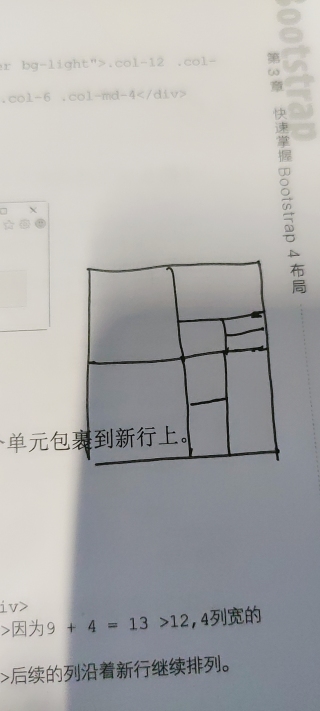
想要实现这个样式,貌似嵌套实现不出来,