最近在暑期培训学习R语言,学习生物信息相关知识,但是本科完全没有学过,暑假还想学车,学艺不精还请各位海涵,想请教这个火山图好像有点丑陋了:(是不是我的代码哪里出问题了。数据是GSE145313
library(DESeq2)
library(tidyverse)
library(ggplot2)
library(ggrepel)
library(clusterProfiler)
library(org.Hs.eg.db)
# 1. 数据预处理
count_data <- GSE145313_POLK_raw_counts
clean_data <- count_data %>%
filter(!is.na(Ensembl)) %>%
distinct(Ensembl, .keep_all = TRUE)
# 2. 构建DESeq2对象
count_matrix <- clean_data %>%
dplyr::select(-hgnc_symbol) %>%
column_to_rownames("Ensembl") %>%
as.matrix()
sample_info <- data.frame(
sample = colnames(count_matrix),
condition = factor(
rep(c("Control", "POLK_KO"), each = 3),
levels = c("Control", "POLK_KO")
),
row.names = colnames(count_matrix)
)
# 3. 差异分析(添加低表达过滤)
dds <- DESeqDataSetFromMatrix(
countData = count_matrix,
colData = sample_info,
design = ~ condition
)
# 过滤低表达基因(counts总和>10)
dds <- dds[rowSums(counts(dds)) > 10, ]
dds <- DESeq(dds)
# 4. 结果提取与注释
res <- results(
dds,
contrast = c("condition", "POLK_KO", "Control"),
alpha = 0.05,
#lfcThreshold = 1
)
res_annotated <- as.data.frame(res) %>%
rownames_to_column("Ensembl") %>%
left_join(
distinct(clean_data, Ensembl, hgnc_symbol),
by = "Ensembl"
) %>%
relocate(hgnc_symbol, .after = Ensembl)
# 5. 质量控制
plotDispEsts(dds)# 检查离散度
vsd <- vst(dds, blind = FALSE)# PCA分析
plotPCA(vsd, intgroup = "condition") +
geom_label(aes(label = name))
sampleDists <- dist(t(assay(vsd)))
pheatmap::pheatmap(as.matrix(sampleDists))#样本相关性热图
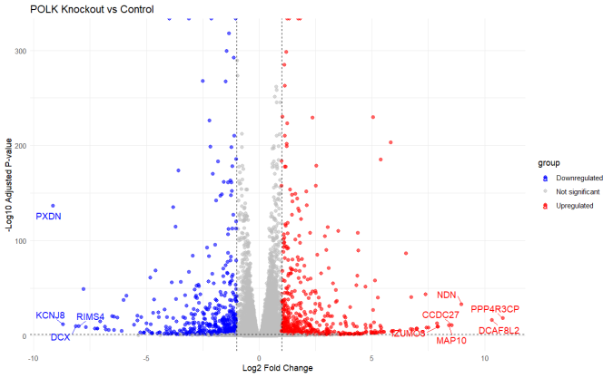
# 6. 火山图
res_annotated <- res_annotated %>%
mutate(
group = case_when(
padj < 0.05 & log2FoldChange > 1 ~ "Upregulated",
padj < 0.05 & log2FoldChange < -1 ~ "Downregulated",
TRUE ~ "Not significant"
)
)
# 仅标注显著差异基因中的top10
top10_sig <- res_annotated %>%
filter(group %in% c("Upregulated", "Downregulated")) %>%
arrange(desc(abs(log2FoldChange))) %>%
head(10)
ggplot(res_annotated, aes(x = log2FoldChange, y = -log10(padj), color = group)) +
geom_point(alpha = 0.6, size = 2) +
scale_color_manual(values = c("blue", "grey", "red")) +
geom_vline(xintercept = c(-1, 1), linetype = "dashed") +
geom_hline(yintercept = -log10(0.05), linetype = "dashed") +
geom_text_repel(
data = top10_sig,
aes(label = hgnc_symbol),
size = 4,
box.padding = 0.5,
max.overlaps = 20
) +
labs(
title = "POLK Knockout vs Control",
x = "Log2 Fold Change",
y = "-Log10 Adjusted P-value"
) + theme_minimal()
# 7. 结果保存
write_csv(res_annotated, "DESeq2_full_results.csv")
# 保存显著差异基因(应用筛选条件)
sig_genes <- res_annotated %>%
filter(padj < 0.05 & abs(log2FoldChange) > 1) %>%
arrange(padj)
write_csv(sig_genes, "Significant_DEGs.csv")
# dotpic
# 从之前结果中提取显著差异基因(padj<0.05且|log2FoldChange|>1)
sig_genes <- res_annotated %>%
filter(padj < 0.05 & abs(log2FoldChange) > 1)
# 1. 基因ID转换(Ensembl -> Entrez)
entrez_ids <- bitr(
sig_genes$Ensembl,
fromType = "ENSEMBL",
toType = "ENTREZID",
OrgDb = org.Hs.eg.db
)
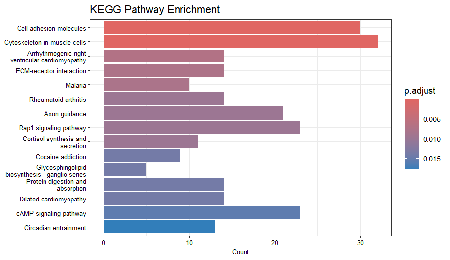
# 2. KEGG富集分析
kegg_enrich <- enrichKEGG(
gene = entrez_ids$ENTREZID,
organism = "hsa", # 人类KEGG代码
keyType = "kegg",
pvalueCutoff = 0.05,
pAdjustMethod = "BH",
qvalueCutoff = 0.2
)
# 3. 结果可视化
# 条形图(按计数排序)
barplot(kegg_enrich,
showCategory = 15,
title = "KEGG Pathway Enrichment",
font.size = 8)
# 点图(综合展示富集水平)
dotplot(kegg_enrich,
showCategory = 15,
title = "KEGG Pathway Enrichment")
# 4. 保存结果
write_csv(as.data.frame(kegg_enrich), "KEGG_Enrichment_Results.csv")