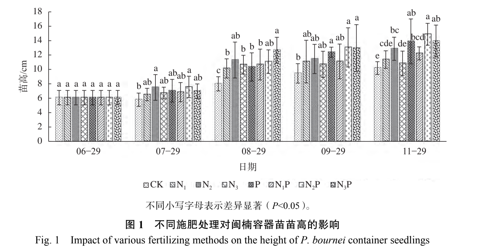
自己尝试做出来的图:
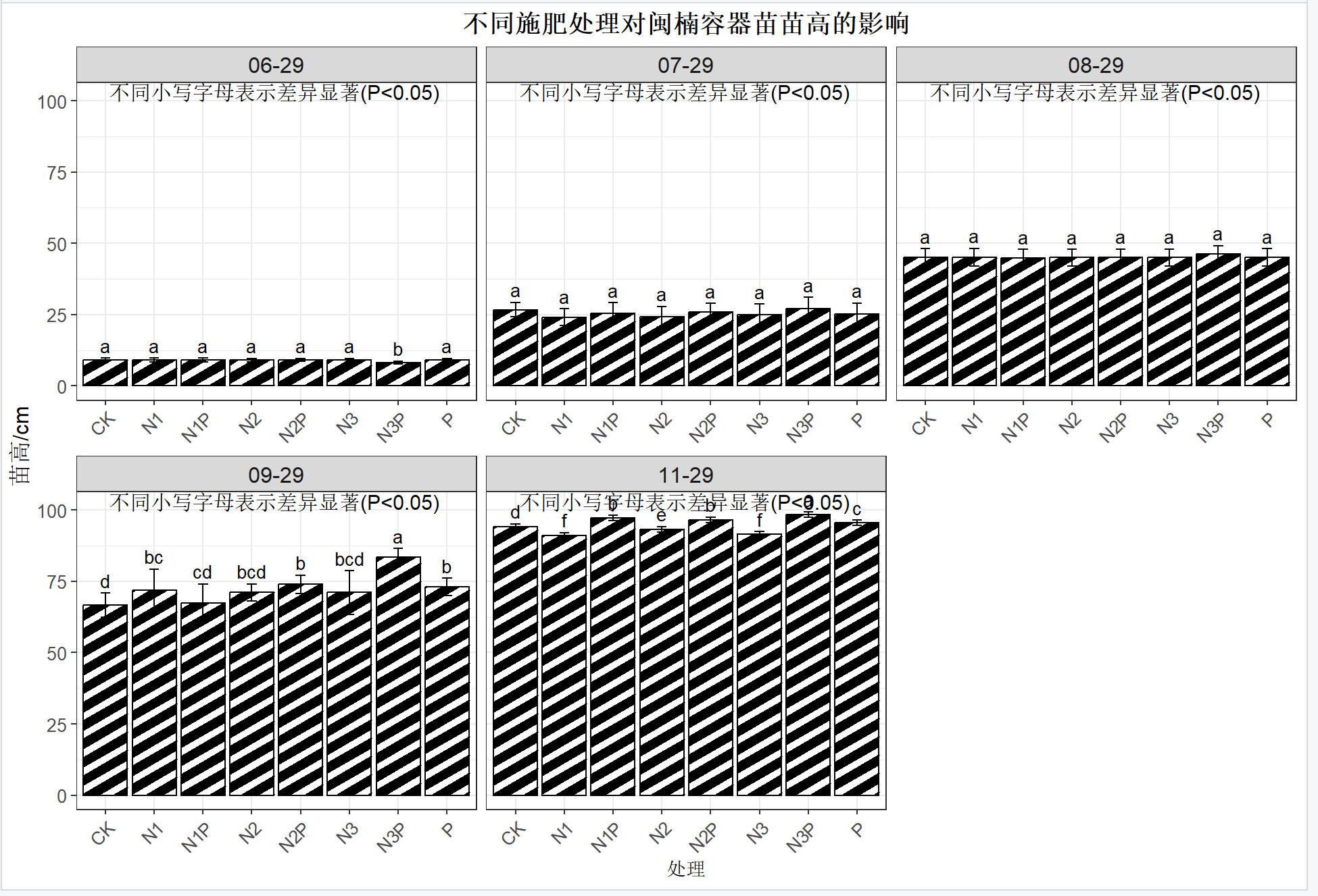
想请教一下应该怎么调整才能和示例图一样排版美观?

 分享
分享
 关注
关注让 “紫雾凌寒” 来帮你回答,本回答结合 DeepSeek
如果还有问题,请评论或点击头像私信,如果有帮助到您, 请关注、采纳、点赞
theme(axis.title = element_text(size = 14, color = "blue"))来设置坐标轴标题的字体大小和颜色。例如:library(ggplot2)
ggplot(mtcars, aes(x = wt, y = mpg)) +
geom_point() +
theme(axis.title = element_text(size = 14, color = "blue"))
geom_point或geom_line等图形函数,可以通过color参数设置线条或点的颜色,size参数设置线条粗细或点的大小。比如:ggplot(mtcars, aes(x = wt, y = mpg)) +
geom_point(color = "red", size = 3)
theme(panel.background = element_rect(fill = "lightgray"))设置图形背景颜色。例如:ggplot(mtcars, aes(x = wt, y = mpg)) +
geom_point() +
theme(panel.background = element_rect(fill = "lightgray"))
theme(legend.position = "top")等设置图例位置,theme(legend.title = element_text(size = 12))设置图例标题字体大小等。例如:ggplot(mtcars, aes(x = wt, y = mpg, color = cyl)) +
geom_point() +
theme(legend.position = "top", legend.title = element_text(size = 12))
theme函数:theme函数以及在图形函数中设置相关参数,可以对Rstudio中做出的图形进行排版美化,使其更接近示例图的美观程度。具体的调整需要根据示例图的具体样式要求,灵活运用这些设置方法。 希望以上解答对您有所帮助。如果您有任何疑问,欢迎在评论区提出。
分享 创建了问题
7月13日
创建了问题
7月13日


