Trp_Cys 2026-01-14 17:11 采纳率: 57.1%
浏览 2
已结题

R语言富集分析可视化出现文字堆叠现象如何解决?

img

# install.packages("colorspace")
# options(repos = c(CRAN = "https://mirrors.tuna.tsinghua.edu.cn/CRAN/"))
# install.packages("stringi")
# install.packages("ggplot2")
# 
# if (!requireNamespace("BiocManager", quietly  =  TRUE))
#     install.packages("BiocManager")
# BiocManager::install("org.Hs.eg.db")
# BiocManager::install("DOSE")
# BiocManager::install("clusterProfiler")
# BiocManager::install("enrichplot")


#引用包
library("clusterProfiler")
library("org.Hs.eg.db")
library("enrichplot")
library("ggplot2")

pvalueFilter = 0.05       #p值过滤条件
qvalueFilter = 0.05       #矫正后的p值过滤条件

#定义颜色
colorSel = "qvalue"
if(qvalueFilter>0.05){
  colorSel = "pvalue"
}

setwd("F:\\A基于神经网络的胃癌基因筛选\\3.GO富集分析")           #设置工作目录
rt = read.table("diff.txt", header = T, sep = "\t", check.names = F)     #读取输入文件

#基因名字转换为基因id
genes = as.vector(rt[,1])
entrezIDs = mget(genes, org.Hs.egSYMBOL2EG, ifnotfound = NA)
entrezIDs = as.character(entrezIDs)
gene = entrezIDs[entrezIDs != "NA"]        #去除基因id为NA的基因

#GO富集分析
kk = enrichGO(gene = gene, OrgDb = org.Hs.eg.db, pvalueCutoff = 1, qvalueCutoff = 1, ont = "all", readable = T)
GO = as.data.frame(kk)
GO = GO[(GO$pvalue<pvalueFilter & GO$qvalue<qvalueFilter),]
#保存富集结果
write.table(GO, file = "GO.txt", sep = "\t", quote = F, row.names  =  F)

#定义显示GO的数目
showNum = 10
if(nrow(GO)<30){
  showNum = nrow(GO)
}

#柱状图
pdf(file = "barplot.pdf", width = 7, height = 7)
bar = barplot(kk, drop = TRUE, showCategory = showNum, split = "ONTOLOGY", color = colorSel) + facet_grid(ONTOLOGY~., scale = 'free')
print(bar)
dev.off()

#气泡图
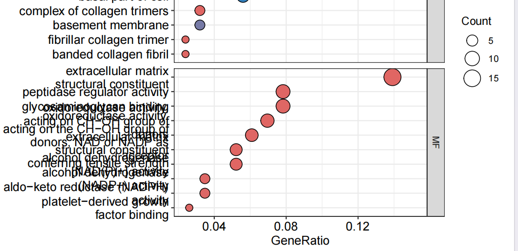
pdf(file = "bubble.pdf", width = 7, height = 7)
bub = dotplot(kk, showCategory = showNum, orderBy = "GeneRatio", split = "ONTOLOGY", color = colorSel) + facet_grid(ONTOLOGY~., scale = 'free')
print(bub)
dev.off()

#获取GO信息
go=data.frame(Category=GO$ONTOLOGY, ID=GO$ID, Term=GO$Description, Genes = gsub("/", ", ", GO$geneID), adj_pval = GO$p.adjust)
#读取基因的logFC
genelist <- data.frame(ID=rt$id, logFC=rt$logFC)
row.names(genelist)=genelist[,1]
#设置圈图参数
circ <- circle_dat(go, genelist)
termNum =8       #显示GO数目
termNum=ifelse(nrow(go)<termNum,nrow(go),termNum)
geneNum=200      #限定基因数目
geneNum=ifelse(nrow(genelist)<geneNum, nrow(genelist), geneNum)
#绘制圈图
chord <- chord_dat(circ, genelist[1:geneNum,], go$Term[1:termNum])
pdf(file="GOcircos.pdf", width=10, height=10)
GOChord(chord, 
        space = 0.001,           #基因之间的间距
        gene.order = 'logFC',    #按照logFC值对基因排序
        gene.space = 0.25,       #基因名跟圆圈的相对距离
        gene.size = 5,           #基因名字体大小 
        border.size = 0.1,       #线条粗细
        process.label = 6)       #GO字体大小
dev.off()

#聚类图
pdf(file="GOcluster.pdf",width=12, height=10)
GOCluster(circ, 
          go$Term[1:termNum], 
          lfc.space = 0.2,        #logFC与树之间的空隙大小
          lfc.width = 1,          #logFC的圆圈宽度
          term.space = 0.2,       #logFC与GO之间空隙的大小
          term.width = 1)         #GO圆圈的宽度
dev.off()  
  • 写回答

2条回答 默认 最新

  • 檀越@新空间 2026-01-14 17:12
    关注

    下午好🌅🌅🌅
    本答案参考通义千问

    在使用 R 语言进行富集分析并可视化时,如果出现文字堆叠现象(例如柱状图、气泡图或圈图中的标签重叠),通常是因为标签过多、字体过大或图表布局不合理导致的。以下是解决文字堆叠问题的详细解决方案:


    1. 调整图表布局和参数

    重点部分:
    通过调整图表的布局参数可以有效减少文字堆叠。

    解决方案步骤:

    1. 增加图表宽度和高度:

      • 增加 pdf() 中的 widthheight 参数,使图表有更多空间展示内容。
      pdf(file = "barplot.pdf", width = 10, height = 10)
      
    2. 调整 barplotdotplotshowCategory 参数:

      • 减少显示的 GO 项数量,避免过多标签导致堆叠。
      showNum = 5  # 减少显示的 GO 数目
      
    3. 调整 facet_gridscale = 'free' 参数:

      • 如果不需要自由缩放,可以设置为 scale = 'fixed',以保持所有子图比例一致。
      bar = barplot(kk, drop = TRUE, showCategory = showNum, split = "ONTOLOGY", color = colorSel) + facet_grid(ONTOLOGY~., scale = 'fixed')
      
    4. 调整 dotplotsizelabel 参数:

      • 减小字体大小或仅显示部分标签。
      bub = dotplot(kk, showCategory = showNum, orderBy = "GeneRatio", split = "ONTOLOGY", color = colorSel, size = 3) + facet_grid(ONTOLOGY~., scale = 'free')
      

    2. 调整文字标签的格式和显示方式

    重点部分:
    优化标签的显示方式,如缩短标签长度、使用缩写或换行。

    解决方案步骤:

    1. 缩短 GO 描述标签:

      • 使用 substr()strwrap() 对描述信息进行截断或换行处理。
      GO$Description <- strwrap(GO$Description, width = 30)  # 每行最多显示30个字符
      
    2. dotplot 中使用 label 参数:

      • 只显示部分标签或使用缩写。
      bub = dotplot(kk, showCategory = showNum, orderBy = "GeneRatio", split = "ONTOLOGY", color = colorSel, label = "Term") + facet_grid(ONTOLOGY~., scale = 'free')
      

    3. 调整字体大小和样式

    重点部分:
    减小字体大小可避免文字堆叠。

    解决方案步骤:

    1. ggplot2 图表中设置字体大小:

      • 使用 theme() 设置字体大小。
      bar = barplot(kk, drop = TRUE, showCategory = showNum, split = "ONTOLOGY", color = colorSel) + 
        facet_grid(ONTOLOGY~., scale = 'free') +
        theme(text = element_text(size = 10))  # 设置字体大小为10
      
    2. circleplotchordplot 中调整标签大小:

      • 修改 GOChord()chord_dat() 的参数。
      GOChord(chord, 
              space = 0.001, 
              gene.order = 'logFC', 
              gene.space = 0.25, 
              gene.size = 3,  # 减小基因名称字体大小
              border.size = 0.1, 
              process.label = 4)  # 减小 GO 标签字体大小
      

    4. 使用更合适的可视化类型

    重点部分:
    如果文字堆叠问题无法通过上述方法解决,可以考虑更换其他类型的图表。

    解决方案步骤:

    1. 使用 cnetplot 替代 circleplot

      • cnetplot 更适合展示大量 GO 项。
      pdf(file = "cnetplot.pdf", width = 10, height = 10)
      cnetplot(kk, node.color = "qvalue", label = "Term")
      dev.off()
      
    2. 使用 enrichplot::dotplot 并限制显示的 GO 数目:

      • 控制每张子图显示的 GO 项数目。
      bub = dotplot(kk, showCategory = 10, orderBy = "GeneRatio", split = "ONTOLOGY", color = colorSel) + facet_grid(ONTOLOGY~., scale = 'free')
      

    5. 修改代码示例(关键部分)

    以下是对原代码中可能出现文字堆叠的部分进行修改的建议:

    # 柱状图
    pdf(file = "barplot.pdf", width = 10, height = 10)
    bar = barplot(kk, drop = TRUE, showCategory = 5, split = "ONTOLOGY", color = colorSel) + 
      facet_grid(ONTOLOGY~., scale = 'fixed') + 
      theme(text = element_text(size = 10))
    print(bar)
    dev.off()
    
    # 气泡图
    pdf(file = "bubble.pdf", width = 10, height = 10)
    bub = dotplot(kk, showCategory = 5, orderBy = "GeneRatio", split = "ONTOLOGY", color = colorSel, size = 3) + 
      facet_grid(ONTOLOGY~., scale = 'fixed') + 
      theme(text = element_text(size = 10))
    print(bub)
    dev.off()
    
    # 圈图
    GO$Description <- strwrap(GO$Description, width = 30)  # 截断描述信息
    chord <- chord_dat(circ, genelist[1:geneNum,], go$Term[1:termNum])
    pdf(file="GOcircos.pdf", width=12, height=12)
    GOChord(chord, 
            space = 0.001, 
            gene.order = 'logFC', 
            gene.space = 0.25, 
            gene.size = 3, 
            border.size = 0.1, 
            process.label = 4)
    dev.off()
    

    6. 其他建议

    • 使用 ggplot2 自定义图表: 如果 enrichplot 的默认图表仍无法满足需求,可以尝试使用 ggplot2 手动绘制图表。
    • 使用 cowplotpatchwork 组合多个图表: 避免单个图表过于拥挤。

    总结

    文字堆叠问题可以通过以下方式解决:

    1. 调整图表尺寸和布局参数
    2. 优化标签显示方式(截断、换行、缩写)
    3. 减小字体大小
    4. 限制显示的 GO 项数量
    5. 更换可视化类型(如 cnetplot
    6. 手动调整 ggplot2 图表

    如果你能提供具体的图表截图或错误信息,我可以进一步帮助你定位问题。

    本回答被题主选为最佳回答 , 对您是否有帮助呢?
    评论
查看更多回答(1条)

报告相同问题?

问题事件

  • 系统已结题 1月23日
  • 已采纳回答 1月15日
  • 创建了问题 1月14日