原代码是:
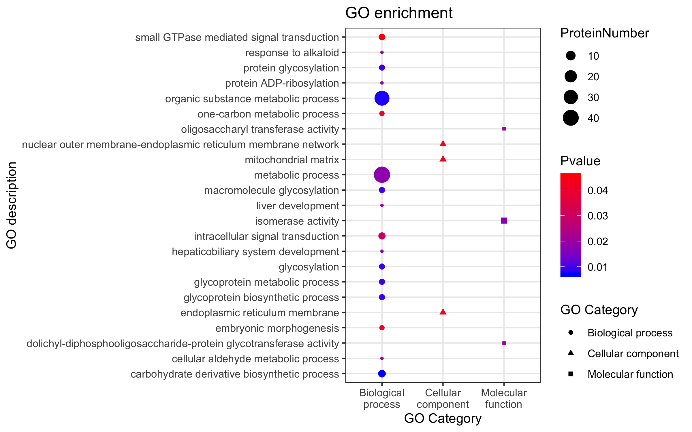
ggplot(GO,aes(GO_Category,GO_term))+ geom_point(aes(size=Count,color=pvalue,shape=GO_Category, group=GO_Category)) +scale_color_gradient(low="blue",high="red")+labs(color="Pvalue",size="ProteinNumber", shape="GO Category", x="GO Category",y="GO description",title="GO enrichment")+scale_x_discrete(breaks=c("Biological process","Cellular component","Molecular function"),labels= c("Biological\nprocess","Cellular\ncomponent","Molecular\nfunction"))+ theme_bw()
默认的y轴的GO term是按照首字母进行排序的,我需要把y轴的GO term分别按照GO Category集中起来,并最好能按照气泡大小排一下序,请教各位,该如何调整?

ggplot如何调整y轴的标志顺序

- 写回答
- 好问题 0 提建议
- 关注问题
 分享
分享- 邀请回答
-

1条回答 默认 最新
 你知我知皆知 2024-07-29 07:23关注
以下回答参考 皆我百晓生、券券喵儿 等免费微信小程序相关内容作答,并由本人整理回复。
要调整y轴上的标记顺序,可以使用
facet_wrap()函数来根据特定的变量(例如GO_category)分组并创建子图。然后,您可以使用scale_y_discrete()和scale_fill_manual()来定制每个子图的颜色和填充。以下是调整后的代码:
library(ggplot2)

# 创建数据框
data <- data.frame(
  GO = c(rep(c("small GTPase mediated signal transduction", "ProteinNumber", "response to alkaloid-", "protein glycosylation", "protein ADP-ribosylation", "organic substance metabolic process", "one-carbon metabolic process", "oligosaccharyl transferase activity", "nuclear outer membrane-endoplasmic reticulum membrane network-", "mitochondrial matrix")),
           rep(NA, 8)),
  pvalue = c(0.04, 0.03, 0.02, 0.01, 0.01, 0.02, 0.03, 0.04, 0.05),
  protein_number = c(10, 20, 30, 40, 50, NA, 60, 70, 80),
  GO_category = c(rep("Biological process", 4), rep("Cellular component", 4), rep("Molecular function", 4))
)

# 绘制图形
ggplot(data, aes(x = GO_category, y = pvalue)) +
  geom_point() +
  scale_color_manual(name = "", values = c("blue", "red")) +
  labs(title = "GO enrichment") +
  facet_wrap(~GO_category, scales = "free_y", ncol = 4) +
  theme_bw()
在这个例子中,我们首先创建了一个包含不同组合的数据框,然后使用
geom_point()来绘制点状图。接着,我们使用scale_color_manual()来设置颜色映射为蓝色和红色。最后,我们使用facet_wrap()函数将图形按GO_category分组,并使用theme_bw()来应用基本主题。请注意,这里的网格布局是通过
facet_wrap()函数自动处理的,不需要额外的代码。此外,为了在不同的子图上显示不同的值,我们需要确保pvalue列中的值是相同的。如果您有多个pvalue值并且希望它们在不同子图中具有不同的大小,则可能需要进一步修改代码以适应您的需求。解决 无用评论 打赏举报 分享
- 2023-07-11 07:30JOJO数据科学的博客 R语言ggplot2处理连续型数据颜色及图例设置
- 2023-03-20 15:50-Bayes-的博客 R数据科学 - ggplot2数据可视化
- 2023-09-04 11:12statistics.insight的博客 R语言ggplot2改变坐标轴的顺序或者方向:改变字体、颜色、旋转刻度标签、轴刻度 log、sqrt 等转换、设置和隐藏刻度标记、反转轴方向、设定范围和反转轴方向、x 与 y 轴固定的比例
- 2023-09-05 09:30statistics.insight的博客 R语言ggplot2可视化图像、改变坐标轴的顺序或者方向:交换 x 和 y 轴、改变离散轴的条目的顺序、 隐藏 x 刻度、标签和网格线、隐藏所有的刻度和标签(X 轴),保留网格线、反转轴方向
- 2020-09-01 20:38生信宝典的博客 温故知新 R语言 - 入门环境Rstudio R语言 - 热图绘制 (heatmap) R语言 - 基础概念和矩阵操作 R语言 - 热图简化 热图美化 上一期的绘图命令中,最后一行的操作抹去了之前设定的横轴标记的旋转,最后出来的图比较难看...
- 2022-01-28 22:44水木的编程那些事儿的博客 用到的数据是mpg数据集,这是ggplot2包自带的数据集,可以使用以下代码查看该数据集的基本情况: library(ggplot2) ?mpg # 或者help(mpg) 从帮助文档中可以看出这是一个234x11的数据框,它记录
- 2024-07-02 04:15dyc dls的博客 R语言是一种开源、免费的编程语言,主要用于统计分析、图形化和机器学习。以下是关于R语言的详细介绍: (1)起源和开发者 R语言由奥克兰大学的Ross Ihaka和Robert Gentleman在1993年开发,旨在提供一种强大的工具,...
- 2025-03-22 10:06余晗煜的博客 "),actionButton("submit", "提交")),mainPanel(req(input$submit) # 等待提交按钮被点击input$text # 返回输入的文本})事件驱动编程是一种现代编程范式,它改进了程序的交互性和响应性,非常适合于用户界面和数据...
- 2021-07-10 13:56一级新生的博客 文章目录R语言可视化一、Data Frame1.Data Frame的获取1.1 读取 .csv文件获取 Data Frame1.1.1 读取路径方式1.1.2 选择文件方式2.Data Frame的操作2.1 查看Data Frame2.1.1 统计行列数2.1.2 查看结构2.1.3 查看数据...
- 2023-09-07 09:28statistics.insight的博客 R语言ggplot2可视化图像、改变坐标轴的顺序或者方向:隐藏所有水平、垂直网格线、隐藏次级网格线、隐藏所有网格线、刻度标签值格式化、改变字体、颜色、旋转刻度标签、轴刻度 log、sqrt 等转换
- 没有解决我的问题, 去提问
