
Lets say we have the following markup:
<div class="container-fluid">
    <div class="row">
        <div class="col-xs-6 col-md-4 col-lg-3">
            <img src="..." alt="..." />
        </div>
        <!--
            And, possibly, many more columns,
            which are printed dynamically using
            the PHP's foreach loop
        -->
    </div>
</div>
The resulting markup contains only one row and lots of columns. However, this is not useful at all: the grid is supposed to have 2 columns on extra small screens, 3 columns on medium screens and 4 columns on large screens, with a separate row for each collection of columns.
The above technique, though, produces markup that is not semantic and problems begin to emerge whenever one decides that he/she wants to separate rows of columns with a border.
If the layout was static (non-responsive), I could simply output a separate row after every X image(column) in the foreach loop, but this obviously doesn't work for responsive layouts.
The responsive approach seems to introduce more problems than I originally anticipated, because the server side can not distinguish whether the user has resized his browser window or not (and reload the columns with a different markup and number of rows accordingly). Making AJAX calls for this would be overkill and I don't really want to use JQuery to rewrap columns based on screen width, which leaves me at the mercy of nasty CSS hacks.
Is there a proper way to accomplish this?
EDIT: There is a way to do this, but it's also not the preferred one: output several grids with a different number of columns and show each of them using media queries. Although this is a possibility, I would never want to do this, because it produces bad markup and it's possibly bad for SEO as well.
EDIT 2:
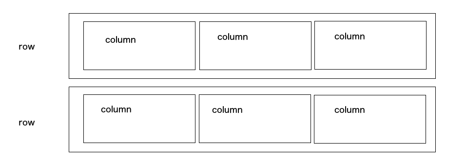
Here's what I'm trying to achieve:
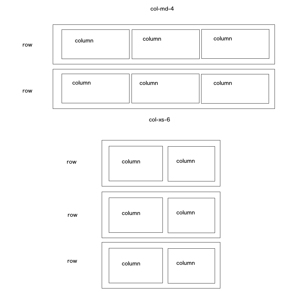
However, I also need to do this dynamically for each screen size.
EDIT: 3: Here's how the layout should behave on different screen sizes:
This seems to be difficult to achieve on a responsive layout. The reason I need to have separate rows is because I want each row to have a border-bottom CSS property. I can currently add such a separator using the :after CSS pseudo element on every nth column in the grid, but the CSS for such a separator is quite ugly (the separator needs to go full-width and since the pseudo element is a child of the column, I'm using absolute positioning in this case):
&:after {
   content: "";
   position: absolute;
   width: 420%;
   height: 1px;
   left: -160%;
   background-color: black;
}
Is the above CSS the right way to do it? How else can I achieve this?


