
代码如下
df=pd.read_csv('https://raw.githubusercontent.com/selva86/datasets/master/mpg_ggplot2.csv')
df_select = df.loc[df.cyl.isin([4,8]),:]
#isin(x) 判断x是否存在序列中,若存在则返回True
#绘制图像
sns.set_style('white')
gridobj = sns.lmplot(x='displ'# 横坐标:发动机排量
                    ,y='hwy'# 纵坐标,公路里程
                    ,hue='cyl'#分类,气缸数量
                    ,data=df_select
                    #,height=8# 图像的高度
                    ,aspect=1.6#图像的纵横比
                    ,legend=False
                    ,palette='tab10'#色板
                    ,scatter_kws=dict(s=60,linewidth=0.7,edgecolors='black')
)

gridobj.set(xlim=(0.5,7.5),ylim=(0,50))
plt.rcParams['font.sans-serif']=['Simhei']#显示中文,并且中文的字体时微软雅黑
plt.xlabel('发动机排量(L)',fontsize=20)
plt.ylabel('公里路程/加仑',fontsize=20)
plt.xticks(fontsize=16)
plt.yticks(fontsize=16)
plt.legend(['气缸数量:4','气缸数量:8'],fontsize=22)
plt.title('Scatterplot with line of best fit')
plt.show()
图片输出后是这个样子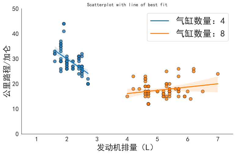
seaborn库 和matplotlib都是最新版


