更何况不过刚好 2022-02-10 08:30 采纳率: 86.4%
浏览 61
已结题

echart的雷达图

img


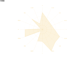
我用echart做了这样的一个图,想要请问如何让这个文字,只显示wsne这四个字母,而不显示东东南等词呢?不能把她们删除,因为tooiltip提示框需要把所有名称都显示出来,删除的话提示框也不会有了


option = {
  title: {
    text: '玫瑰图'
  }, 
  tooltip: {
        show: true,
        textStyle:{
          color :'#fff'
          
        },
         backgroundColor  :'rgba(0,0,0,0.7)'
    },
  legend: {
    data: ['风速玫瑰图'],
    show: false, //不显示图例,
    
  },
  radar: {
    shape: 'circle',
    axisName: {
      // color: 'rgba(238, 197, 102,1)' //标签的样式
      lineStyle:{color: [
          'rgba(238, 197, 102, 0)',
          'rgba(238, 197, 102, 0)',
          'rgba(238, 197, 102, 0.4)',
          'rgba(238, 197, 102, 0.6)',
          'rgba(238, 197, 102, 0.8)',
          'rgba(238, 197, 102, 0.4)',
          'rgba(238, 197, 102, 0.6)',
          'rgba(238, 197, 102, 0.8)',
          'rgba(238, 197, 102, 102)',
          'rgba(238, 197, 102, 0)',
          'rgba(238, 197, 102, 0)',
          'rgba(238, 197, 102, 0)',
          'rgba(238, 197, 102, 0)',
          'rgba(238, 197, 102, 0)',
          'rgba(238, 197, 102, 0)',
          'rgba(238, 197, 102, 0)'
        ].reverse(),
    }},
    splitLine: {
      lineStyle: {
        color: [
          'rgba(238, 197, 102, 0.1)',
          'rgba(238, 197, 102, 0.2)',
          'rgba(238, 197, 102, 0.4)',
          'rgba(238, 197, 102, 0.6)',
          'rgba(238, 197, 102, 0.8)',
          'rgba(238, 197, 102, 1)'
        ].reverse(),
        type:"dashed"//虚线
      } //每层圆圈的样式
    },
    splitArea: {
      show: false //不显示划分每个区域的样式
    },
    indicator: [
      { name: 'N', max: 6500 },
      { name: '北北西', max: 16000 },
      { name: '西北', max: 30000 },
      { name: '西西北', max: 38000 },
      { name: 'W', max: 52000 },
      { name: '西西南', max: 25000 },
       { name: '西南', max: 52000 },
      { name: '南南西', max: 25000 },
       { name: 'S', max: 52000 },
      { name: '南南东', max: 25000 },
       { name: '东南', max: 52000 },
      { name: '东东南', max: 25000 },
       { name: 'E', max: 52000 },
      { name: '东东北', max: 25000 },
       { name: '东北', max: 52000 },
      { name: '北北东', max: 25000 }
    ],
    axisLine: {
      lineStyle: {
        color: 'rgba(238, 197, 102, 0.5)', //由圆点往外的线的样式
        type:"dashed"//虚线

      }
    }
  },
  series: [
    {
      name: 'Budget vs spending',
      type: 'radar',
      data: [
        {
          value: [5000, 4500, 20000, 3000, 40089, 21000,5000, 14000, 28000, 26000, 42000, 21000],
          name: '风速玫瑰图'
        }
      ],
      itemStyle: {
        color: 'rgb(238, 197, 102)' //线的样式
      },
      areaStyle: {
        color: 'rgba(238, 197, 102,0.3)'
      },
      lineStyle: {//线的长度
        width: 1,
        // opacity: 0.5
      },
      symbol: 'none',//让拐点消失

    }
  ]
};

  • 写回答

2条回答 默认 最新

  • 一只成序源 2022-02-10 13:50
    关注
    
     
        option = {
          title: {
            text: '玫瑰图'
          }, 
          tooltip: {
                show: true,
                textStyle:{
                  color :'#fff'
                  
                },
                 backgroundColor  :'rgba(0,0,0,0.7)',
                 formatter:(e)=>{
                     let value=e.data.value;
                     let str=``;
                     let name= ['N','北北西','西北','西西北', 'W', '西西南',  '西南','南南西', 'S', '南南东', '东南','东东南', 'E','东东北', '东北','北北东',
    ]
                     value.forEach((item,index)=>{
                         str+=`<span>${name[index]}:${item}</span><br/>`
                     })
                     return str;
                 }
            },
          legend: {
            data: ['风速玫瑰图'],
            show: false, //不显示图例,
            
          },
          radar: {
            shape: 'circle',
            axisName: {
              // color: 'rgba(238, 197, 102,1)' //标签的样式
              lineStyle:{color: [
                  'rgba(238, 197, 102, 0)',
                  'rgba(238, 197, 102, 0)',
                  'rgba(238, 197, 102, 0.4)',
                  'rgba(238, 197, 102, 0.6)',
                  'rgba(238, 197, 102, 0.8)',
                  'rgba(238, 197, 102, 0.4)',
                  'rgba(238, 197, 102, 0.6)',
                  'rgba(238, 197, 102, 0.8)',
                  'rgba(238, 197, 102, 102)',
                  'rgba(238, 197, 102, 0)',
                  'rgba(238, 197, 102, 0)',
                  'rgba(238, 197, 102, 0)',
                  'rgba(238, 197, 102, 0)',
                  'rgba(238, 197, 102, 0)',
                  'rgba(238, 197, 102, 0)',
                  'rgba(238, 197, 102, 0)'
                ].reverse(),
            }},
            splitLine: {
              lineStyle: {
                color: [
                  'rgba(238, 197, 102, 0.1)',
                  'rgba(238, 197, 102, 0.2)',
                  'rgba(238, 197, 102, 0.4)',
                  'rgba(238, 197, 102, 0.6)',
                  'rgba(238, 197, 102, 0.8)',
                  'rgba(238, 197, 102, 1)'
                ].reverse(),
                type:"dashed"//虚线
              } //每层圆圈的样式
            },
            splitArea: {
              show: false //不显示划分每个区域的样式
            },
            indicator: [
              { name: 'N', max: 6500 },
              { name: '', max: 16000 },
              { name: '', max: 30000 },
              { name: '', max: 38000 },
              { name: 'W', max: 52000 },
              { name: '', max: 25000 },
               { name: '', max: 52000 },
              { name: '', max: 25000 },
               { name: 'S', max: 52000 },
              { name: '', max: 25000 },
               { name: '', max: 52000 },
              { name: '', max: 25000 },
               { name: 'E', max: 52000 },
              { name: '', max: 25000 },
               { name: '', max: 52000 },
              { name: '', max: 25000 }
            ],
            axisLine: {
              lineStyle: {
                color: 'rgba(238, 197, 102, 0.5)', //由圆点往外的线的样式
                type:"dashed"//虚线
         
              }
            }
          },
          series: [
            {
              name: 'Budget vs spending',
              type: 'radar',
              data: [
                {
                  value: [5000, 4500, 20000, 3000, 40089, 21000,5000, 14000, 28000, 26000, 42000, 21000],
                  name: '风速玫瑰图'
                }
              ],
              itemStyle: {
                color: 'rgb(238, 197, 102)' //线的样式
              },
              areaStyle: {
                color: 'rgba(238, 197, 102,0.3)'
              },
              lineStyle: {//线的长度
                width: 1,
                // opacity: 0.5
              },
              symbol: 'none',//让拐点消失
         
            }
          ]
        };
    

    在tooltip中设置一下就可以了,至于样式的话,自己自定义一下,我这里简单写了一下,你自己修改成你自己需要的

    本回答被题主选为最佳回答 , 对您是否有帮助呢?
    评论
查看更多回答(1条)

报告相同问题?

问题事件

  • 系统已结题 2月18日
  • 已采纳回答 2月10日
  • 创建了问题 2月10日

悬赏问题

  • ¥15 请教一下各位,为什么我这个没有实现模拟点击
  • ¥15 执行 virtuoso 命令后,界面没有,cadence 启动不起来
  • ¥50 comfyui下连接animatediff节点生成视频质量非常差的原因
  • ¥20 有关区间dp的问题求解
  • ¥15 多电路系统共用电源的串扰问题
  • ¥15 slam rangenet++配置
  • ¥15 有没有研究水声通信方面的帮我改俩matlab代码
  • ¥15 ubuntu子系统密码忘记
  • ¥15 保护模式-系统加载-段寄存器
  • ¥15 电脑桌面设定一个区域禁止鼠标操作