
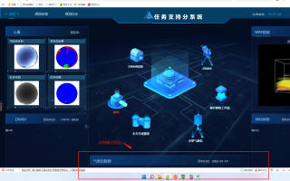
问题情况展示
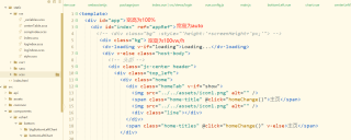
css样式
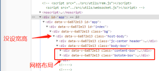
控制台层级关系
ps:使用了插件使得现在的代码里px单位已经转为了rem
这里是宽度自适应的情况——(使用了媒体查询)
```html
@media (min-width: 1440px) and (max-width: 1680px){
 #bottomLeft{//一些页面的盒子
      width: 1vw !important;
    }
  #bottomCenter {//一些页面的盒子
    width: 35vw !important;
    margin-left: 7vw !important;
  }
  #bottomRight {//一些页面的盒子
      width: 36vw !important;
  }
  #centerLeft1{//一些页面的盒子
    width: 1vw !important;
  }
  #centerRight1 {//一些页面的盒子
      width: 36vw !important;
  }
  #centerRight2 {//一些页面的盒子
    width: 47vw !important;
  }
  .top{//一些页面的盒子
    width: 31vw !important;
  }
  .center{//一些页面的盒子
    width: 36vw !important;
  }
  .bottom{//一些页面的盒子
    width: 36vw !important;
  }
  }/*>=1440的设备*/
  @media (min-width: 1680px)and (max-width: 1920px){
    .bg{
      // width: 100vw !important;
      // height: 100vh !important;
      }
    #bottomLeft{//一些页面的盒子
      width: 1vw !important;
    }
  #bottomCenter {//一些页面的盒子
    width: 40vw !important;
    // width: 46.5vw !important;
    margin-left: 6.5% !important;
  }
  #bottomRight {//一些页面的盒子
      width: 31.5vw !important;
      // width: 28.5vw !important;
  }
  #centerLeft1{//一些页面的盒子
    width: 1vw !important;
  }
  #centerRight1 {//一些页面的盒子
      width: 31.5vw !important;
      // width: 28.5vw !important;
  }
  #centerRight2 {//一些页面的盒子
    width: 47vw !important;
  }
  .top{//一些页面的盒子
    width: 31vw !important;
    // width: 38vw !important;
  }
  .center{//一些页面的盒子
    // width: 36vw !important;
    width: 39.5vw !important;
  }
  .bottom{//一些页面的盒子
    width: 36vw !important;
  }
  }/*>=1680的设备*/
  @media (min-width: 1920px){
    #bottomLeft{//一些页面的盒子
        width: 1vw !important;
      }
    #bottomRight {//一些页面的盒子
        width: 29vw !important;
    }
    #centerLeft1{//一些页面的盒子
      width: 1vw !important;
    }
    #centerRight1 {//一些页面的盒子
        width: 29vw !important;
    }
    #centerRight2 {//一些页面的盒子
      width: 47vw !important;
    }
    .bg{
      // width: 100vw !important;
      // height: 100vh !important;
      }
      #bottomCenter {//一些页面的盒子
        width: 46.3vw !important;
        margin-left: 0.5% !important;
      }
      .top,.center,.bottom{//一些页面的盒子
        width: 44vw !important;
      }
  } /*>=1920的设备*/
  @media (min-width: 1940px){
    #bottomRight {//一些页面的盒子
        width: 31vw !important;
    }
    #centerLeft1{//一些页面的盒子
      width: 1vw !important;
    }
    #centerRight1 {//一些页面的盒子
        width: 31vw !important;
    }
      #bottomCenter {//一些页面的盒子
        width: 44vw !important;
        margin-left: -0.5% !important;
      }
  }
```


