<style>
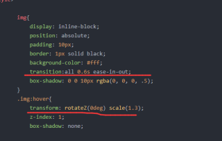
img{
display: inline-block;
position: absolute;
padding: 10px;
border: 1px solid black;
background-color: #fff;
transition:all 0.6s ease-in-out;
box-shadow: 0 0 10px rgba(0, 0, 0, .5);
}
.img:hover{
transform: rotateZ(0deg) scale(1.3);
z-index: 1;
box-shadow: none;
}
img:nth-child(1){
top: 100px;
left: 100px;
transform: rotateZ(30deg);
}
img:nth-child(2){
top: 100px;
left: 200px;
transform: rotateZ(60deg);
}
img:nth-child(3){
top: 100px;
left: 400px;
transform: rotateZ(70deg);
}
img:nth-child(4){
top: 100px;
left: 550px;
transform: rotateZ(10deg);
}
img:nth-child(5){
top: 100px;
left: 900px;
transform: rotateZ(30deg);
}
img:nth-child(6){
top: 100px;
left: 400px;
transform: rotateZ(20deg);
}
img:nth-child(7){
top: 400px;
left: 300px;
transform: rotateZ(40deg);
}
img:nth-child(8){
top: 400px;
left: 100px;
transform: rotateZ(40deg);
}
img:nth-child(9){
top: 400px;
left: 600px;
transform: rotateZ(40deg);
}
img:nth-child(10){
top: 400px;
left: 700px;
transform: rotateZ(40deg);
}
</style>
<body>
    <div>
        <img src="./1.jpg" width="200px" alt="" class="img">
        <img src="./2.jpg" width="200px" alt="" class="img">
        <img src="./3.jpg" width="200px" alt="" class="img">
        <img src="./4.jpg" width="200px" alt="" class="img">
        <img src="./5.jpg" width="200px" alt="" class="img">
        <img src="./6.jpg" width="200px" alt="" class="img">
        <img src="./7.jpg" width="200px" alt="" class="img">
        <img src="./8.jpg" width="200px" alt="" class="img">
        <img src="./9.jpg" width="200px" alt="" class="img">
        <img src="./10.jpg" width="200px" alt="" class="img">

    </div>
</body>
他这个使用img选择伪元素时,只有那个transform不生效,但是用伪类选择就可以生效