HTML代码
<div id="player" class=".fixed_div" style="top:85px;left:0px">
<!-- 歌曲信息模块 -->
<div id="player-content1">
<!-- 歌曲名 -->
<div class="music-name"></div>
<!-- 歌手名 -->
<div class="artist-name"></div>
<!-- 歌曲时间 -->
<div class="time">
<!-- 当前播放的时间 -->
<div class="current-time"></div>
<!-- 歌曲总时长 -->
<div class="total-time"></div>
</div>
<!-- 进度条 -->
<div id="s-area">
<!-- 鼠标移动到进度条上,显示的时间信息 -->
<div id="ins-time"></div>
<!-- 鼠标移动到进度条上,进度条变暗部分-->
<div id="s-hover"></div>
<!-- 表示当前歌曲播放进度的蓝色进度条 -->
<div id="seek-bar"></div>
</div>
</div>
<!-- 控制模块 -->
<div id="player-content2">
<!-- 左侧歌曲封面旋转模块 -->
<div class="music-imgs">
<!-- 封面图 -->
<div class="img"></div>
<!-- 歌曲缓冲时的提示文字 -->
<div id="buffer-box">缓冲…</div>
</div>
<!-- 右侧歌曲操作模块 -->
<div class="player-controls">
<!-- 上一首按钮 -->
<div class="btn prev iconfont"></div>
<!-- 暂停/播放 按钮 -->
<div class="btn play-pause icon-jiediankaishi iconfont"></div>
<!-- 下一首按钮 -->
<div class="btn next iconfont"></div>
</div>
</div>
</div>
css代码
*{
    margin: 0;
    padding: 0;
    box-sizing: border-box;

}
#player{
    position: relative;
    top: 100px;


}
/* 歌曲信息模块 */
#player-content1{
    position: absolute;
    top:0px;
    left:15px;
    width:320px;
    height:90px;
    padding:0 20px 0 130px;
    background: rgb(209, 226, 245);
    border-top-left-radius: 10px;
    border-top-right-radius: 10px;
    /* transition过渡动画:设置top属性过渡,过渡时间0.3s,速度曲线为ease(逐渐变慢) */
    transition:top 0.3s ease;
}
#player-content1.active{
    top:-85px;
}
.music-name,
.artist-name{
    height: 20px;
    margin-top:5px;
    font-size:14px;
}
.artist-name{
    font-size:12px;
    color: #656565
}
.time{
    font-size:12px;
    height:15px;
    margin: 5px 0;
}
.current-time{
    float: left;
}
.total-time{
    float: right;
}
.current-time,.total-time{
    color: transparent;
    font-size: 11px;
    background-color: #e8f5ff;
    border-radius: 10px;
    transition: 0.3s ease all;
}
.time.active .current-time, .time.active .total-time{
    color: rgb(54, 127, 196);
    background-color: transparent;
}


#s-area, #seek-bar{
    position: relative;
    height: 4px;
    border-radius: 4px;
}

#s-area{
    background-color:#e8f5ff;
    cursor: pointer;
}

#ins-time{
    position: absolute;
    top: -29px;
    color: #fff;
    font-size: 12px;
    white-space: pre;
    padding: 5px 6px;
    border-radius: 4px;
    display:none;
}

#s-hover{
    position: absolute;
    top: 0;
    bottom: 0;
    left: 0;
    opacity: 0.2;
    z-index: 2;
}

#ins-time, #s-hover{
    background-color: #4b4d5c;
}

#seek-bar{
    content: '';
    position: absolute;
    top: 0;
    bottom: 0;
    left: 0;
    width: 0;
    background-color: rgb(54, 127, 196);
    transition: 0.2s ease width;
}

#player-content2{
    position: relative;
    width:350px;
    height:90px;

    background: #fff;
    border-radius: 20px;
    box-shadow: 0 30px 80px #656565;
}
/* 左侧封面图模块 */
.music-imgs{
    position: absolute;
    top: -40px;
    width: 100px;
    height: 100px;
    margin-left: 30px;
    -webkit-transform: rotateZ(0);
    transform: rotateZ(0);
    transition: 0.3s ease all;
    box-shadow: 0 0 0 10px #fff;
    border-radius: 50%;
    overflow: hidden;
}
/* 左侧封面图模块添加了active类名 */
.music-imgs.active{
    top: -50px;
    box-shadow: 0 0 0 4px #e8f5ff, 0 30px 50px -15px #afb7c1;
}
.music-imgs:before{
    content: '';
    position: absolute;
    top: 50%;
    right: 0;
    left: 0;
    width: 20px;
    height: 20px;
    margin: -10px auto 0 auto;
    background-color: #d6dee7;
    border-radius: 50%;
    box-shadow: inset 0 0 0 2px #fff;
    z-index: 2;
}
/* 左侧封面图模块下的 图片div */
.music-imgs .img{
    display: block;
    position: absolute;
    top: 0;
    left: 0;
    width: 100%;
    height: 100%;
}
/* 封面图模块添加了active类名后,图片div的样式添加 */
.music-imgs.active .img{
    z-index: 1;
    -webkit-animation: rotateAlbumArt 3s linear 0s infinite forwards;
            animation: rotateAlbumArt 3s linear 0s infinite forwards;
}
@-webkit-keyframes rotateAlbumArt
{
    0%{ -webkit-transform: rotateZ(0); transform: rotateZ(0); }
    100%{ -webkit-transform: rotateZ(360deg); transform: rotateZ(360deg); }
}

@keyframes rotateAlbumArt
{
    0%{ -webkit-transform: rotateZ(0); transform: rotateZ(0); }
    100%{ -webkit-transform: rotateZ(360deg); transform: rotateZ(360deg); }
}
#buffer-box
{
    position: absolute;
    top: 50%;
    right: 0;
    left: 0;
    height: 13px;
    color: #1f1f1f;
    font-size: 13px;
    font-family: Helvetica;
    text-align: center;
    font-weight: bold;
    line-height: 1;
    padding: 6px;
    margin: -12px auto 0 auto;
    background-color: rgba(255, 255, 255, 0.19);
    opacity: 0;
    z-index: 2;
}

.music-imgs .img, #buffer-box
{
    transition: 0.1s linear all;
}

.music-imgs.buffering .img
{
    opacity: 0.25;
}

.music-imgs.buffering .img.active
{
    opacity: 0.8;
    filter: blur(2px);
    -webkit-filter: blur(2px);
}

.music-imgs.buffering #buffer-box
{
    opacity: 1;
}

.player-controls{
    position: absolute;
    top:20px;
    left:150px;
}
.player-controls .btn{
    float: left;
    width:60px;
    height:60px;
    line-height: 60px;
    font-size:24px;
    color:#D6DEE7;
}
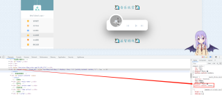
问题截图